The trend towards better-for-you foods and beverages has been ongoing and continues as the pandemic reignited our desire to be healthy. In fact, 93% of people say they eat healthy some of the time, while 63% say they eat healthy most or all of the time, and 52% follow some kind of eating pattern, up from 39% in 2021. These numbers should give CPG brands encouragement to continue developing products that fall into the better-for-you (BFY) category.
But how do we ensure that consumers get the right message once the product hits the shelves? Brand managers and marketers know the grocery store and e-commerce shop are cluttered experiences for the consumer, with shoppers purchasing the same items they typically buy every time they shop. And yet, your package design, that has undergone services like https://www.printron.com/our-design-adaptation/, is the biggest asset you have in the driving trial, as everyone who shops the category will encounter the product. How, then, can the brand better use package design to encourage the trial of BFY products?
UNDERSTANDING THE BFY CONSUMER’S RELATIONSHIP TO TASTE
With 93% of consumers saying they eat healthy at least some of the time, brands have a huge audience to reach. One of the key mistakes brands make when launching BFY products is that, in their effort to communicate the healthier benefits, they forget to emphasize taste as much as they would a traditional product. Regardless of the health benefits, people want to know if their food will taste good. In fact, BFY products need to amp up appetite appeal significantly to overcome consumer perception that healthy means less delicious.
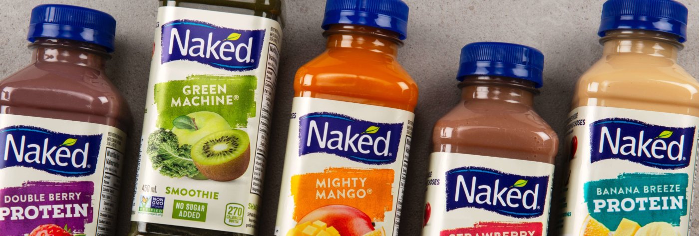
Image Source: SLD
USING VISUAL CUES TO DENOTE A BFY PRODUCT
Consumers shop the aisle, website, or app quickly. They barely notice what they are looking at until a key visual cue gets them to pay attention. This could be the color they recognize as their preferred brand’s color or a bold name that jumps out at them. There are a few key factors brand managers should consider for a BFY package design from a visual perspective, according to custom labels Melbourne.
1. Use existing equity in a line extension. If you are creating a BFY version of an existing product, help the consumer make the connection by leveraging key visual elements from the core line. This could include a dominant brand color, logo, or highly recognizable visual that consumers connect to the product. KraftHeinz used its core blue brand color and logo to keep that dominant shelf block when introducing its BFY versions of its classic Kraft Dinner, KD Simply. They then added new cues to help the consumer understand the new product.
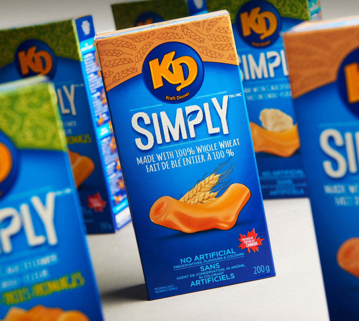
Image Source: SLD
2. Appetite appeal. Consumers will look to the imagery of the product, especially when considering something new, to decide whether they think it will taste good. If you’re not using full-color photography, consider leveraging merchandising, clever copy, and in-store communications to play up taste cues.
3. BFY heuristics. A heuristic is a mental shortcut, and, in this case, we are talking about visual cues consumers associate with health. Consider texture, color, font, and patterns. Maxwell House cleverly used a tearaway effect to demonstrate their new compostable pods, allowing them to keep their brand design but stopping the eye and creating an instant message.
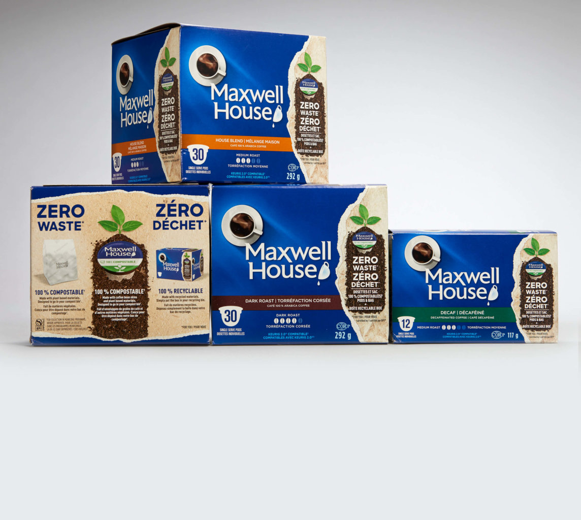
Image Source: SLD
NAMING AND COPY CONSIDERATIONS
Naming has become harder with the sheer number of products in the market. However, product naming is critical for new brands if they want to be remembered.
- Sub-naming. By using the existing product name and adding a qualifier, you can maintain equity while denoting a BFY message. KD Simply is a great example of how this can work. Words such as simple, clean, organic, and pure, can be used as part of a name.
- Avoid overstatements. If you want to call your product “pure” or “clean” you need to make sure the product lives up to that expectation for the consumer, not just legal standards.
- Capture emotion. Naked Juices use a potent double-entendre to grab the attention of consumers as well as convey its value proposition. Made Good creates a sense of connection with the consumer, many of whom are parents looking for a healthier lunchbox snack, by endowing the product with an emotional promise. Avoid clinical-sounding names that do not evoke emotion.
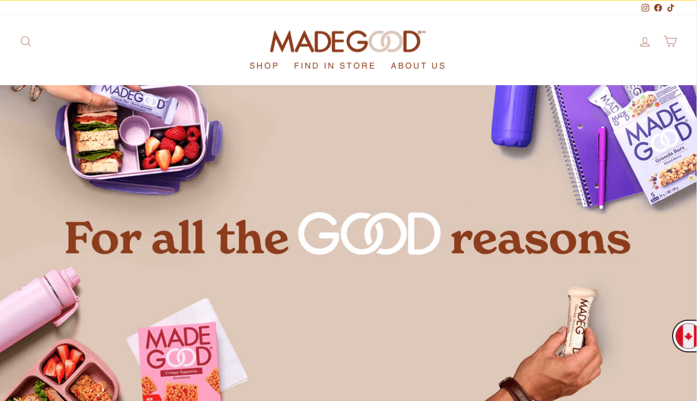
Image Source: MadeGood
- Use inclusive language. Unless you only intend to sell your product to a specific group of people, words such as vegan, vegetarian, keto, or gluten-free should not make up part of the name. Using these words as a part of the naming convention will likely deter consumers who do not relate to that specific group from trying the product. Those who want to find the claim will seek it out.
CLAIMS AND CALLOUTS
That leads us to the role of claims and benefit callouts. The golden rule is just because you CAN make a claim, doesn’t mean you should. We once observed a tea brand that featured no soy, no peanuts, and gluten-free claims on the front panel – perhaps all true, but not concerns highly relevant to the category. In such an example, claims can be confusing and ultimately detrimental.
Eye tracking research indicates that most consumers glaze over claims and benefits, even though many say they read them. Those who are dedicated to specific diets are more likely to pick up a product and read the nutritional information or seek the specific seal they are familiar with. For the average consumer, unless a claim is unique and highly relevant, they will simply ignore it.
Here are some key considerations when it comes to claims:
- Consumers overweigh certain factors. You will need to conduct consumer research to narrow down which key factors will be most relevant to your context, as there is no one-size-fits-all answer to this question. For KraftHeinz’s Hazelnut spread, a claim of “no palm oil” was the key message the brand wanted to communicate as the competitors in the category used this contentious ingredient.
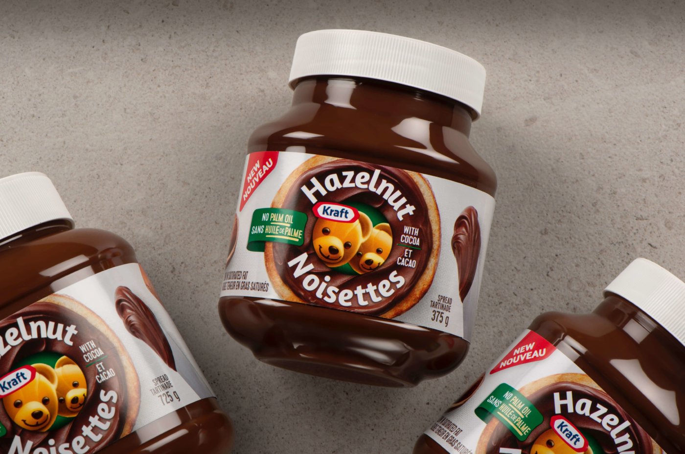
Image Source: SLD
- Be specific. Consumers are wary of vague claims such as “reduced sodium” and will be more likely to trust a specific measurement such as “50% less salt.”
- Feature one or two only for the front panel. Crowding your front panel with numerous claims will mean that none of them stand out. On the side and back panels, you can tell a more in-depth story about the brand’s BFY qualities – this will be meaningful to the consumer once they get the product home and are using it, supporting their decision to purchase it again.
- How to address third-party certifications and industry symbols. Again, third-party claims can crowd the front of a package and many bring little to the table. In some categories, there are “must have” claims, such as dolphin-friendly tuna or certified organic seals. Others may trend for a while and then become so ubiquitous they serve no purpose on the front panel, such as the green recycling symbol. The Certified B-Corp certification is attempting to offer a solution to the multiple claims issue by grouping a range of concerns into one seal. This certification has gained popularity in Europe and is beginning to make headway in North America. Generally, we would suggest regular cleaning up of claims to ensure only the most relevant points are being communicated.
Consumers are looking for balance in their food choices, which is great news for brands developing BFY products. When creating a new brand or tweaking an existing design, helping consumers choose by simplifying the message and using strong, focused cues can make all the difference.