Kraft’s new hazelnut with cocao spread leverages the branding of their iconic peanut butter branding to stop shoppers in their tracks.
CLIENT
Kraft Heinz
PROJECT
Kraft Hazelnut Spread New Brand
Design
RELATED SERVICE
Packaging Design
THINK
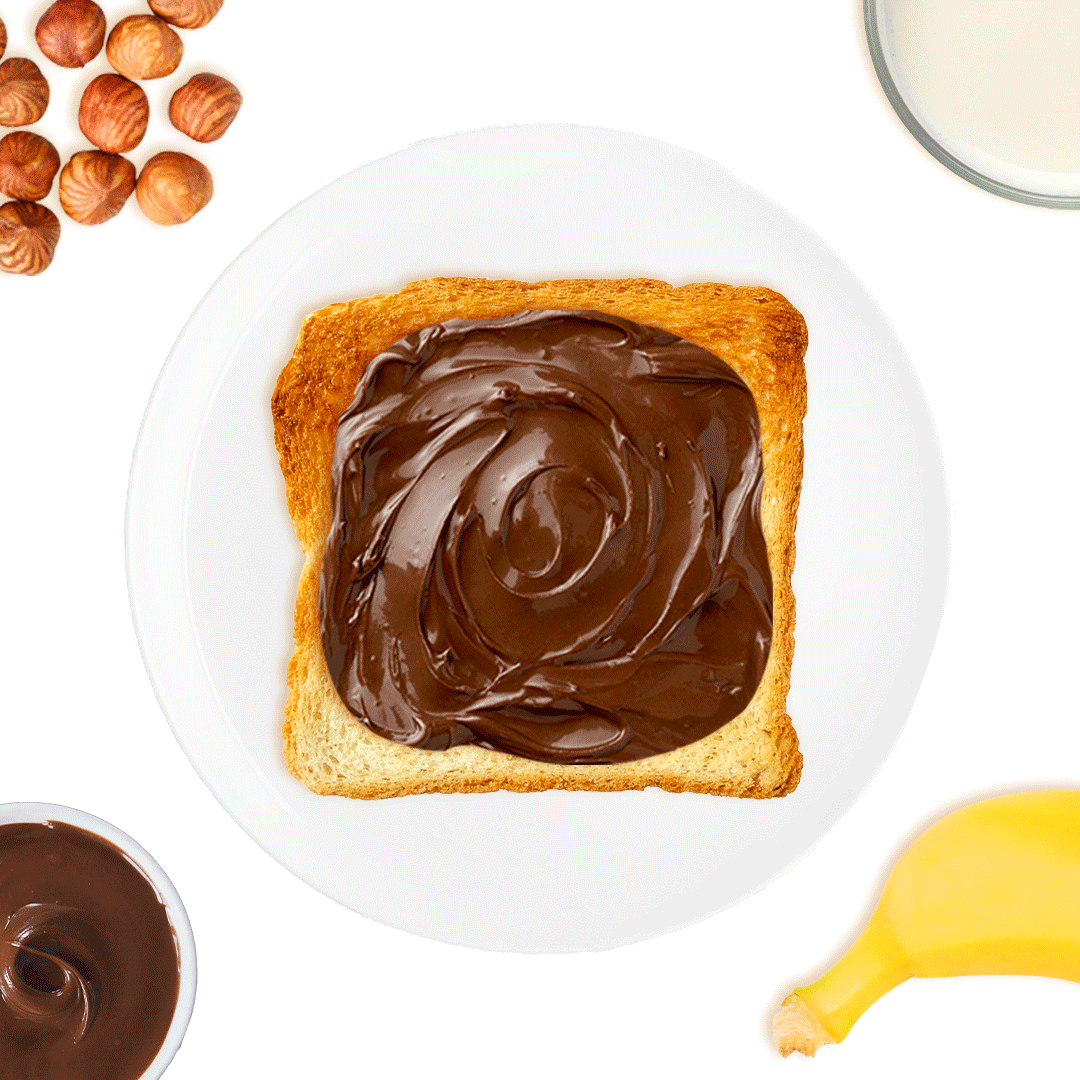
Kraft Peanut Butter is Canada’s favorite peanut butter. Instantly recognizable and beloved by Canadians of all ages, it’s a brand with huge cache. When we approached designing for a new hazelnut spread with cocoa that boasts a delicious flavor, low in saturated fat and no palm oil, we knew it needed to cash in on Kraft’s mega-power brand – while still making a statement of its own.
The package needed to instantly grab the eye and make an impression – but it also needed to clearly communicate the product has no palm oil and is low in saturated fat, a key point of difference from the competition. With these goals in mind, we set about designing a package that could help Kraft Hazelnut Spread shake up the category.
BLINK
As we developed ideas for the Kraft Hazelnut spread with cocoa design, we knew we wanted a clean and bold look with “stopping power.” With limited label space to work with, the round bagel shape creates a bull’s eye, capturing attention. The circular shape is simple, yet powerful and provides a perfect frame for the famous Kraft bears. On the edge of the label we hinted at flavour with a few errant hazelnuts just in view.
Kraft’s Hazelnut with cocoa spread has just hit the stores and is flying off the shelves!