In our packaging series from around the world, we’ve approached and dissected diverse packaging design styles from continents like Asia, Europe, and Oceania. For our journey into South America, rather than styling, we’ll be appreciating packaging design in the context of specific beverage categories, including coffee, tea, wine, and beer.
South American beverages are some of the most revered worldwide. From the artisanal nature of Chilean wine from the heart of the Andes to the flavorful and aromatic world of Columbian coffee, South American packaging continues to represent the vibrant culture and people of the continent in a variety of ways.
Colombia: Coffee
In Colombia, coffee is not just a beverage; it’s a way of life. The country is renowned worldwide for its exceptional coffee quality, with a wide variety of coffee brands, each with unique flavors and characteristics. One iconic example is Juan Valdez. Their coffee packaging beautifully captures the essence of Colombia’s coffee-growing landscape, where the mountains, climate, and regions come together to produce high-quality and varied Colombian coffee.
The graphics on the packaging establish a direct connection with the geographical origin of the brand. While retaining geographical identity, the design can match various color schemes and shapes to enhance the identification and differentiation of its product offerings. This adaptability in colors and shapes allows the brand to represent the Colombian scenery with simplistic yet powerful illustrations, perfectly aligning with its brand positioning as the “#1 brand of premium Colombian coffee”.
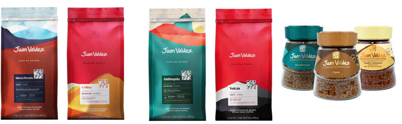
Image Source: Juan Valdez
Argentina: Tea
Tea takes on a unique form in Argentina, with Yerba Mate reigning as the popular herbal infusion of choice. Yerba Mate is deeply woven into the fabric of Argentine culture, especially in terms of friendship and kinship. Playadito, a well-known yerba mate brand, exemplifies the traditional and authentic essence of this beloved brew.
The brand’s classic packaging features a classic serif font for the brand name in red, as well as for the rest of the copies, against the background with eye-catching yellow accents. At the heart of the front panel, Playadito proudly showcases the aromatic herbs that define yerba mate, paying homage to the country’s traditional culture, along with a proud “Made in Argentina” callout. This straightforward and authentic design represents the spirit of a classic Argentine mate, which is an integral part of the national drink of the country.
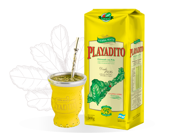
Image Source: Cooperativa Agrícola de la Colonia Liebig
Chile: Wine
Among South American countries, Chile is one of many celebrated for its exceptional wines, with a strong connection with its wineries, the land, and the people. Its location close to the Andes mountains makes it a prime area for growing high-quality grapes for exceptional wine, with many established wineries operating in the area. One revered brand in the Chilean wine scene is Cono Sur, known for its deep appreciation of the winery and the vineyard. Cono Sur’s organic series beautifully encapsulates the essence of organic and natural winemaking.
The packaging incorporates a classy bicycle adorned with botanical elements and butterflies, evoking a rustic ambiance. This imagery conveys the brand’s commitment to organic practices and a genuine connection to the land. Cono Sur preserves its premium roots through a simplistic design, featuring a matte label and the classic cursive brand name. The serif font for the “ORGANIC” wordmark adds a touch of elegance and emphasizes the brand’s dedication to producing high-quality wines.
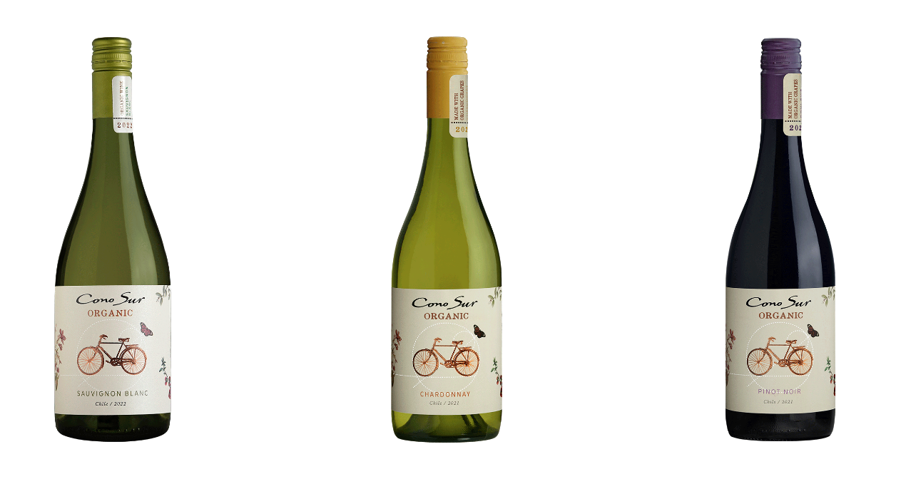
Image Source: Cono Sur
Another prominent wine brand in the region is Bodega Volcanes de Chile, which utilizes the label to convey the product’s extraordinary and unique origin. Stemming from vineyards using volcanic soils, Bodega’s wines are crafted with a unique focus on the country’s many volcanoes.
The volcanic essence of these wines is central to the brand identity, symbolized by the prominent imagery at the heart of the label. These illustrations not only represent the country of origin but also evoke the rich volcanic landscapes. The design of the labels remains deliberately simplistic, allowing the subtle and delicate mineral characteristics of volcanic soils to shine through, offering consumers a premium taste of Chile’s terrain.
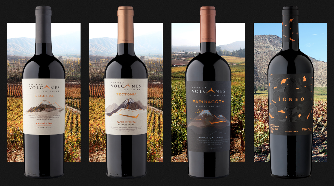
Image Source: Bodega Volcanes de Chile
Brazil: Beer
When it comes to beer in Brazil, Brahma stands as an iconic brand. Brahma’s packaging design for its bottles and cans exudes a sleek and stylish design that mirrors the festive spirit of the country. The Brahma brand name, rendered in a sans-serif font, adds a touch of modernity and approachability to the packaging. The bold use of red and golden yellow colors evokes passion and enthusiasm, mirroring the vibrant Brazilian experience.
The logo itself is a celebration of life, fun, and movement, with the two clinking glasses implying joyful socializing. It radiates the heat and energy of Brazilian culture in a lively and spirited color palette. The can itself seems to be waiting to explode with the same energy and passion found in every corner of Brazil.
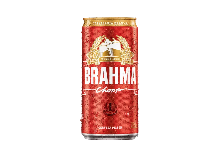
Image Source: Brahma
The Takeaway
Exploring South American beverage packaging has revealed a tapestry of creativity, culture, and heritage. These designs not only represent their countries and product origins but also offer valuable insights for CPG brands. Infused with passion and enthusiasm, packaging designs in South America align with the vibrant art forms of the continent, such as music and dance, embracing life with gusto.
From authentic Colombian coffee to inviting Argentine Mate, each design tells the brand’s story and values. Chilean wine labels connect customers with the winery’s atmosphere and scenic beauty, and Brazilian beer cans mirror the vibrant spirit of the country and its people. These packaging designs go beyond looks; they build connections with consumers who appreciate their stories and values. By understanding and embracing various styles and cultural nuances, brands can create a universal language that resonates with a wide range of audiences, fostering deep connections in the global market.