In the previous blog, we explored how culture influences creativity, starting with inspiration from the continent of Asia. This time, we’re heading to Europe, a place where packaging design has a long and fascinating history. European packaging design is known for its versatility, combining both classic and modern styles of design. It’s a diverse world that reflects the continent’s rich mix of cultures and draws inspiration from historical and artistic influences through elegance and sophistication. Whether it’s traditional or new and innovative, European packaging design is something that CPG brands can get ideas and learn from.
PORTUGAL
Retro
Portugal’s vintage-inspired packaging evokes nostalgia and preserves classic flavors, as illustrated by Luças canned fish. This retro design hints at the brand’s history, having been in business since 1896 while maintaining traditional production methods, further emphasizing the artisanal vibe. The cursive scripts and ornate serifs are adopted to transport consumers back in time. Vintage packaging design can be impressive and enchanting, but it’s essential for CPG brands to adopt it wisely, depending on the product and brand positioning. It can be a powerful yet delicate tool in packaging, connecting with consumers through the charm of the past and tradition.
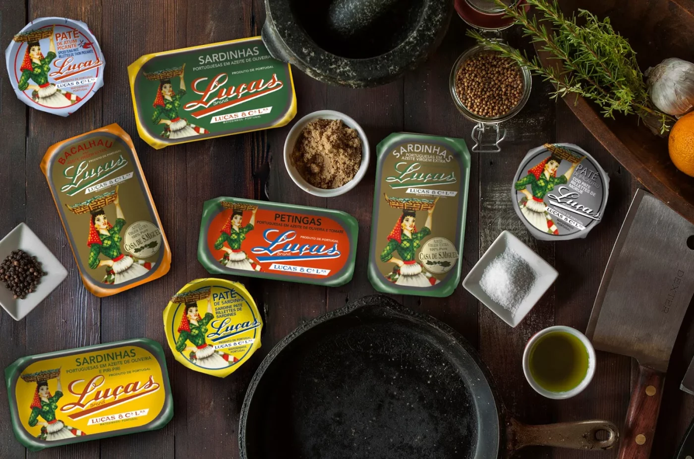
Image Source: Tia Delfina Goods
Heritage
For Portugal, heritage isn’t confined to the interiors and exteriors of historic buildings but extends gracefully into packaging design. One iconic symbol of Portuguese and Spanish artistry is the Azulejo, which means “polished stone” in Arabic. It’s a painted ceramic tilework usually found in churches, palaces, and homes, featuring intricate patterns and scenes. Today, they are applied to modern spaces such as restaurants, bars, and transportation hubs.
These tiles have influenced not only architecture but also graphic design. An example of this can be seen in the packaging of Saudade by Lousani’s bathroom amenities. They seamlessly merge the iconic blue and white Azulejos with minimalist designs on soaps, bath gel, and so on. This beautiful fusion gives a premium and timeless character to the brand, carrying forward a piece of the region’s architectural legacy.
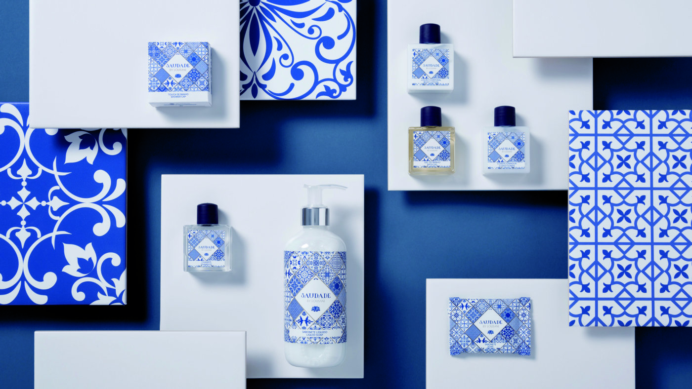
Image Source: Lousani
GERMANY
Technology
When it comes to German design, precision and innovation supported by technology are at the forefront. Advanced manufacturing processes and printing technologies ensure that every element of packaging is executed with accuracy. This philosophy extends to packaging, where technology plays a pivotal role in enhancing product quality.
It enables designers to experiment with innovative materials and packaging structures, improving the consumer experience. An example can be found in Jägermeister’s #SAVETHENIGHT Limited Edition. The package is decorated with a thermochromic pigment using screen printing. The design reveals itself when the optimal drinking temperature of -18°C is reached, signaling to consumers that it’s the perfect moment to enjoy the drink.
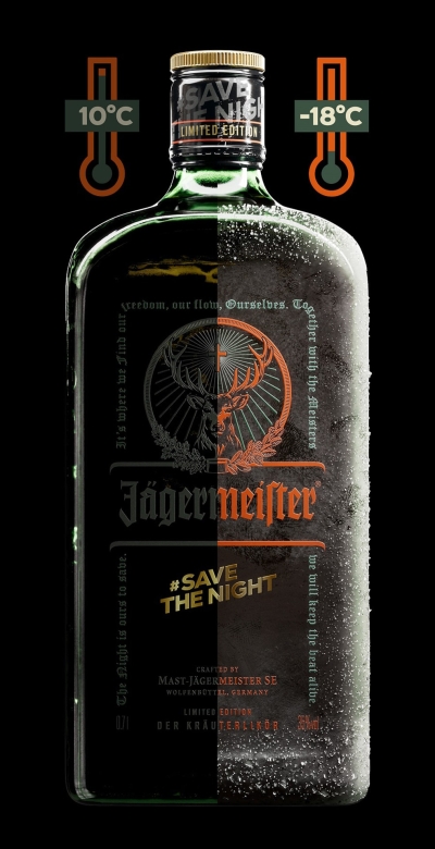
Image Source: Jägermeister
Geometry
Today’s German design takes inspiration from the Bauhaus movement, a revolutionary force in terms of art, design, and architecture that emerged in the early twentieth century. One of the core tenets of the Bauhaus movement is the principle that “form follows function”, meaning that design should prioritize the intended purpose of the object. “Form”, in this definition, should be simplified and serve the practical use of the item.
The Bauhaus style includes the use of simple shapes like circles, squares, and triangles with minimal decoration, constantly pushing the boundaries of design. For example, the package design of St. ERHARD’s beer utilizes geometry, asymmetry, sans-serif and experimental typography, along with primary colors to give its packaging a simplistic look. With a straightforward layout, these elements modernize the brand which resonates with today’s consumers.
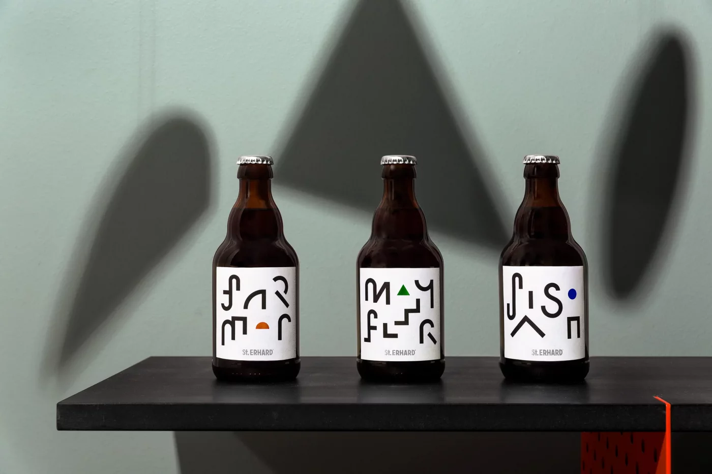
Image Source: Bedow
DENMARK
Craftsmanship
In Denmark, craftsmanship is not just a concept but deeply ingrained in the cultural fabric. The package design of Riberhus® cheese embodies this dedication. Together with the imagery of a cheese maker against the wood color tones, it conveys the message of the brand’s long history and the artisanal technique that is applied by the company to the production of all their cheese. The packaging emphasizes this time-honored craft developed over a century ago, as the traditional cheese-making technique remains central to the brand identity with a strong craftsmanship DNA.
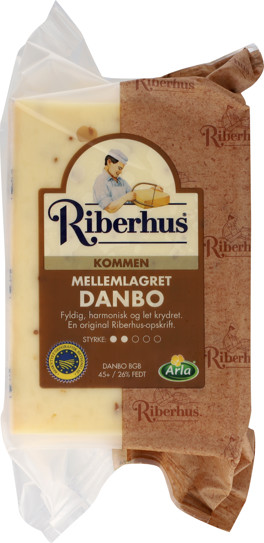
Image Source: Arla
Functionality
Functionality is another core principle in Danish design philosophy, which places a strong emphasis on practicality and efficiency. Since users are at the center of the design process, the packaging is created with an emphasis on the user’s convenience and needs. It not only makes for a visually appealing experience but also ensures that consumers receive clear and informative details, from nutritional content to usage instructions.
An example is Nupo. Their packaging is like an infographic come to life, with a bird’s eye view of the product flavor. It employs a simple white background with clear sans-serif fonts, creating an informative and uncluttered package. The imagery used is modest, putting the focus on the product outcome itself with efficiency and convenience being highlighted. Nupo’s packaging embodies the approach where every element serves a purpose, and the result is a package design that’s as smart as it is aesthetically pleasing.
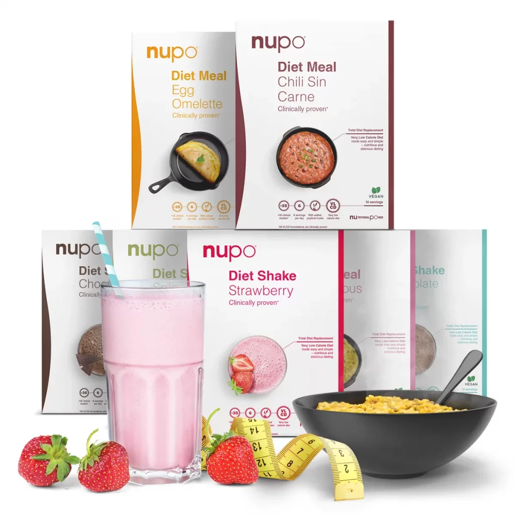
Image Source: Nupo
THE TAKEAWAY
As we journey through various packaging designs in Europe, one thing is clear: legacy and innovation shape CPG packaging. From vintage to cutting-edge technology, European design has the potential to inspire CPG brands all over the world. It demonstrates the power of packaging to create an emotional bond with consumers.
Whether it’s a nod to the past or a leap into the future, every element on the package plays a role in defining the brand. In a global marketplace, understanding the impact of culture is the key to winning the hearts of diverse consumers. Packaging is more than a shell. It tells stories that emotionally connect customers to the brand.