In Canada, an ethnically and culturally diverse country, it’s not hard to find CPG products imported from Asia. What can CPG brands in North America learn from their designs? From the sleek simplicity of Japanese packages to the playful charm of South Korean designs and the intricate artistry of Indian creations, the variety and creativity in packaging across Asia are a remarkable source of inspiration.
This blog will explore the unique characteristics of packaging design in Japan, South Korea, and India, including their approaches which can provide insights for brands wishing to cater to Canada’s ever-evolving consumer landscape. It will also explore some of the cultural influences that shape their design philosophy.
JAPAN
Simplicity
Japanese packaging design embraces simplicity as its core principle. MUJI’s packaging for food and beverages is an iconic example. With a “no-brand” strategy, MUJI’s packaging design in a modern style stands out with its minimalist aesthetic and functionality. Attention to detail and visual clarity further enhance the overall customer experience, reflecting the brand’s identity and resonating with consumers seeking both simplicity and quality in their lifestyles. MUJI’s simplistic design aligns with Japanese philosophy by emphasizing authenticity, practicality, and mindfulness.
Clear designs without redundant noises are valued by Gen Z customers. Overall, Japan’s unique expertise in packaging showcases how simplicity enhances corporate images and customer experiences, offering creative solutions to brand strategies.
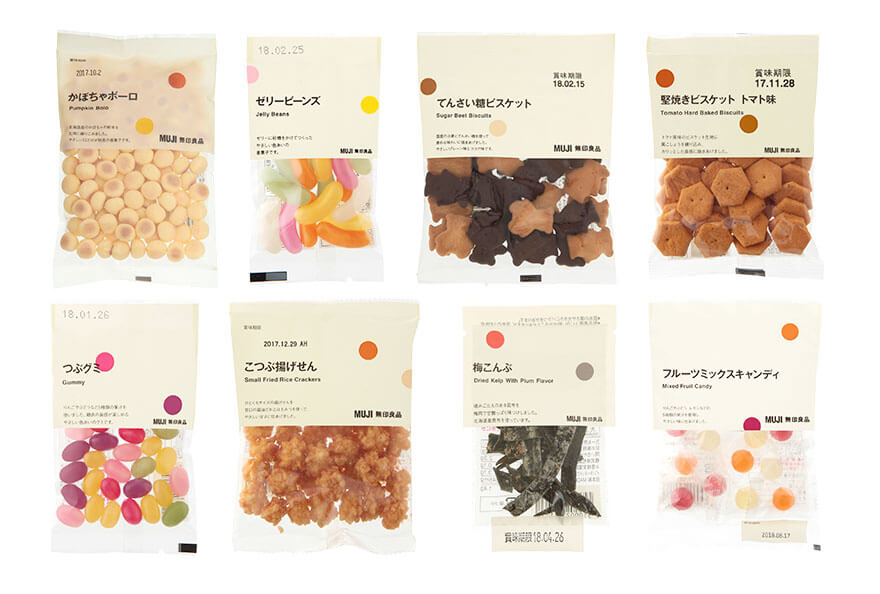
Image Source: MUJI
Meticulosity
Focus on detail and precision are two key characteristics of Japanese design, for both products and packaging. Kansei engineering is a product development methodology originating in Japan, aiming to translate consumers’ emotions and feelings into actual design parameters. It perfectly aligns with the concept of “omotenashi” for exceptional customer experiences, not only in hospitality but also retail. In packaging design, the BLINK factor highlights the importance of building emotional connections. Not only do emotions drive decisions, but consumers make choices in a flash, especially for CPGs.
The packages of Koganei Honey illustrate how meticulous Japanese design can be. It demonstrates thoughtful consideration in user-centricity — by inverting the bottle, the honey naturally settles at the opening, allowing easy extraction until the last drop without the mess. It shows how packages can be designed to solve practical problems and enhance customer experience. Additionally, it captures the product’s essence with a simplistic and straightforward “bee” symbol.
Aesthetics and functional solutions can be blended seamlessly. Typography, materials, printing, and the overall composition are carefully curated, delivering a harmonious and captivating packaging experience. In general, Japanese packaging design strives to combine visual elegance with practical functionality. Each element is thoughtfully crafted to ensure a memorable and meaningful encounter on the store shelves.
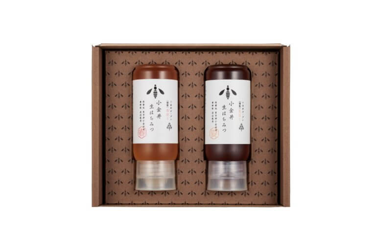
Image Source: Koganei Honey
SOUTH KOREA
Playfulness
Being fun is a prominent feature of CPG packaging design in South Korea. Packages are infused with a sense of joy and playfulness through the use of vibrant colors, illustrations, and cartoon characters. It’s like a visual party that instantly captures your attention and brings a smile to your face. This approach is especially popular in the beauty and skincare industry, such as 3CE, where its fun packaging is designed to make you feel delighted.
The packages tell their own story and create an emotional connection with consumers, often with the inclusion of cute animals or graphics. This is especially common among snacks, confectioneries, and non-alcoholic beverages. For example, the mochi chocolate chip cookies by CW Food feature cartoon illustrations around their package. Along with the handwritten style fonts, it conveys feelings of sweetness, cuteness, and friendliness.
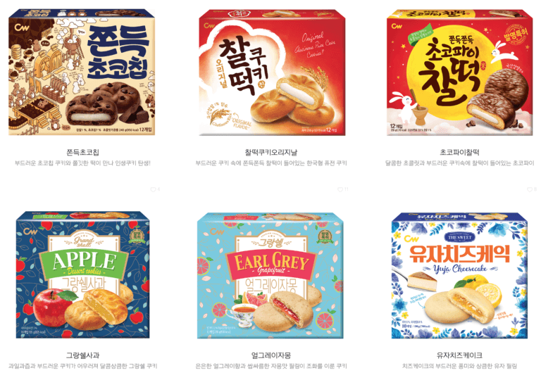
Image Source: CW Food
Naturality
Korean packaging design has a strong focus on nature and organic elements. Earthy tones and botanical illustrations create an authentic and fresh feel. Innisfree, a Korean cosmetic brand, emphasizes natural ingredients through a range of monochromatic green colors in a minimalist style. In nature-inspired designs, their packages bring a sense of purity to the products.

Image Source: Innisfree
INDIA
Tradition
The practices of block printing, embroidery, hand painting, and paper cutting in India have been around for centuries. These techniques demonstrate a unique and handcrafted characteristic of the country’s artistic heritage. Today, we can find these traditional art elements in Indian packaging design for CPG brands, such as Madhubani illustrations. These intricate and colorful paintings depict nature, mythology, and everyday life through tradition. Used correctly, CPG packaging can connect with consumers who appreciate the beauty of traditions and cultural art.
Ornamentation
Indian packaging often takes the form of elaborate designs inspired by traditional art forms like henna patterns. These ornamentations not only add visual interest but also reflect India’s rich cultural heritage and craftsmanship. By incorporating such elements, CPG packaging can evoke a sense of cultural identity. For example, Spirit of the Tribe, one of the award winners of India’s Best Design Project 2021, features its honey and spices in classical and ornamental jars, which help demonstrate the fact that their products are locally sourced from farms in India.
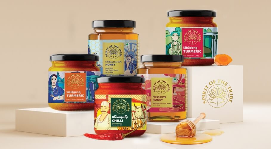
Image Source: IndiDesign
THE TAKEAWAY
As we explore the world of CPG packaging design in Asia, each country clearly brings its distinct perspective to the table. Their designs remind us of the power of packaging to create emotional connections with consumers from different cultures and should serve as inspiration.
Whether it’s through simplistic elegance, delightful playfulness, or ornate beauty, Asian CPG packaging stands by the core principles of aligning design with brand values and attempting to engage with consumers on an emotional level. Given the cultural and ethnic diversity in Canada, brands should stay sensitive to the changes in their target market’s composition and strategize accordingly in terms of product, marketing, and packaging design.