In our packaging design journey around the world, we’ve explored the diverse styles of Asia and the classic elegance of Europe. Now, we will venture into the scenic and vibrant world of Oceania, a region famous for its natural landscapes, fruits, and veggies. Oceania’s packaging design features positivity and a dash of the sunny, carefree spirit that makes you smile across the continent. In this blog, we are introducing two of the countries in this region: Australia and New Zealand. As we dive into the unique packaging world of Oceania, we’ll be taken on a journey that highlights the colorful nature of the continent.
AUSTRALIA
Illustration
When it comes to packaging design in Australia, one of the most prominent features is vibrant illustrations. Take Australia’s Own Foods, for example, a brand known for its plant-based milk offerings. What sets Australia’s Own Foods apart is its playful and botanical approach to packaging. Their organic and specialty plant milks feature enchanting Australian greenery, complemented by the country’s iconic birds. Each product tells a unique story, celebrating the diversity of Australian flora and fauna.
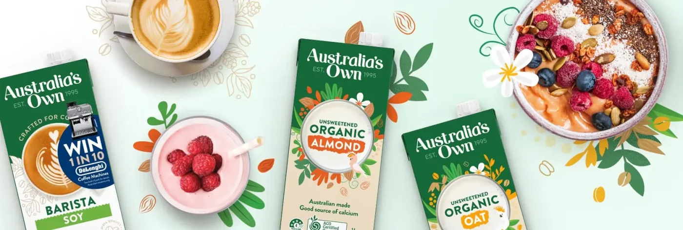
Image Source: Australia’s Own Foods
Another example can be found in Loving Earth’s chocolate. This chocolate brand isn’t just about indulgence, as its values are deeply rooted in environmental sustainability and personal well-being. The earthy cocoa brown blends perfectly with the two background colors, while the illustrations of cocoa provide not just visual appeal but also a deep connection to the raw ingredients. The font is a mix of geometric simplicity and subtle eccentricities, illustrating the overall power of imagery in packaging, not just as a visual delight but as a connection to the products’ heart and soul.
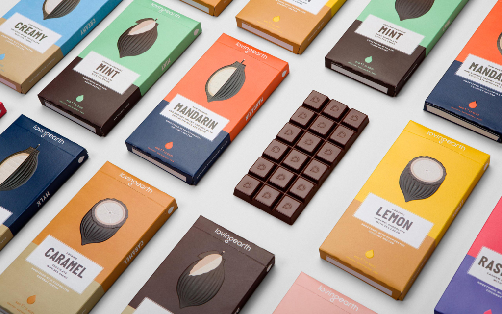
Image Source: BP&O
Animal
Another delightful theme that often emerges is “animal” which commonly intersects with “illustration”. For Coles Supermarket’s confectionery packages, the art of bringing joy to the shelves is a staple of the brand. With private label brands growing in significance across Australian supermarkets, Coles embarked on a transformative journey to revamp their confectionery range. The animals are made cute and adorable through illustrations, while candies are showcased through their mouths. Each product is decorated with a simple yet incredibly effective graphic depiction of happy, expressive faces. They serve as the visual link that runs through the entire product range, aiming to evoke an emotional response and enhance product recognition with a vibrant display of colors.
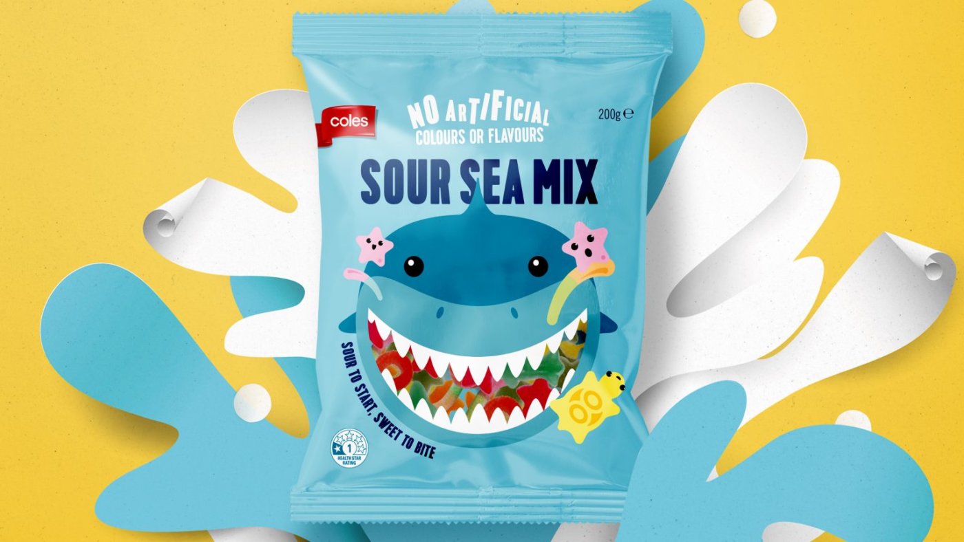
Image Source: Hulsbosch
Olga’s Fine Foods, on the other hand, adds a bold twist to its offerings. The brand took a lighthearted approach to an extraordinary circus-themed packaging style. The design incorporates quirky illustrations that are far from the norm in the meat category. The result is a carnival of colors and distinctive designs that are impossible to overlook on a crowded shelf. These playful illustrations create a brand presence that adds a breath of fresh air to the product category. It has also played a pivotal role in establishing a memorable brand identity across all communication channels, including websites and social media platforms. The use of animals in packaging design is an example of ingenuity with a dash of humor. These examples demonstrate how adding animal-inspired components can give things life and personality, making them not only physically beautiful but also memorable and distinguishable.
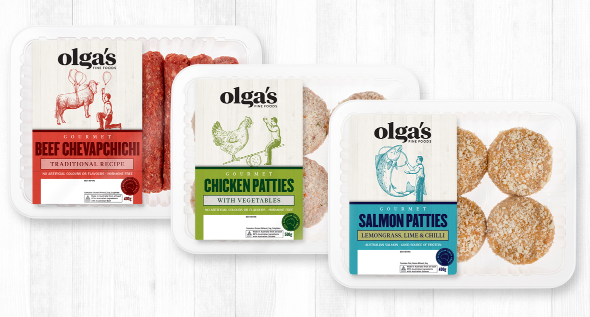
Image Source: Black Squid
NEW ZEALAND
Personification
New Zealand has mastered the art of personification when it comes to packaging design of produce. As one of the largest produce exporters globally, New Zealand is renowned for its abundant fruits, with the iconic Kiwi being one of its main exports. For the Munch’n brand, the Kiwis radiate friendliness, playfulness, and cuteness. The Munch’n Man’s facial expression captures the essence of the product and brand name — those perfect little fruit mouthfuls that you can’t stop popping.
The clear plastic containers for the fruit showcase the product’s quality. The character’s mouth is open, revealing some of the delicious fruits behind him. This clever design implies the message that the character is indulging in the product, making it unique in its ability to personify the consumer’s experience. The Munch’n man acts as a mirror, reflecting what consumers will be like once they purchase and eat the fruit — utterly unable to resist the temptation to keep snacking on fresh Kiwis.
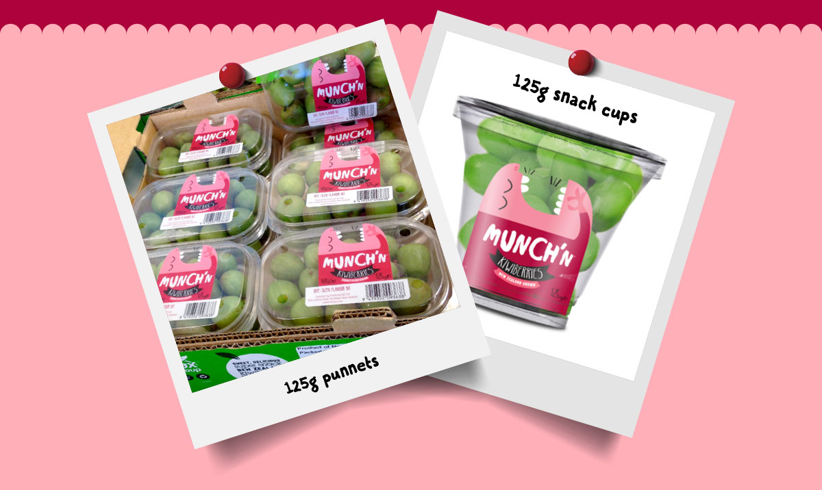
Image Source: Munch’n
Another personification example is Jake’s Avocado™, which utilizes a cute and lively avocado cartoon. This playful character brings the fun element of the product to life, creating a charming appeal that resonates with both kids and adults. The friendly and lively persona of the avocado cartoon not only showcases the product’s freshness but also serves as a versatile marketing tool with the ability to deliver engaging first-person messages like “I’m bursting with nutrients!”
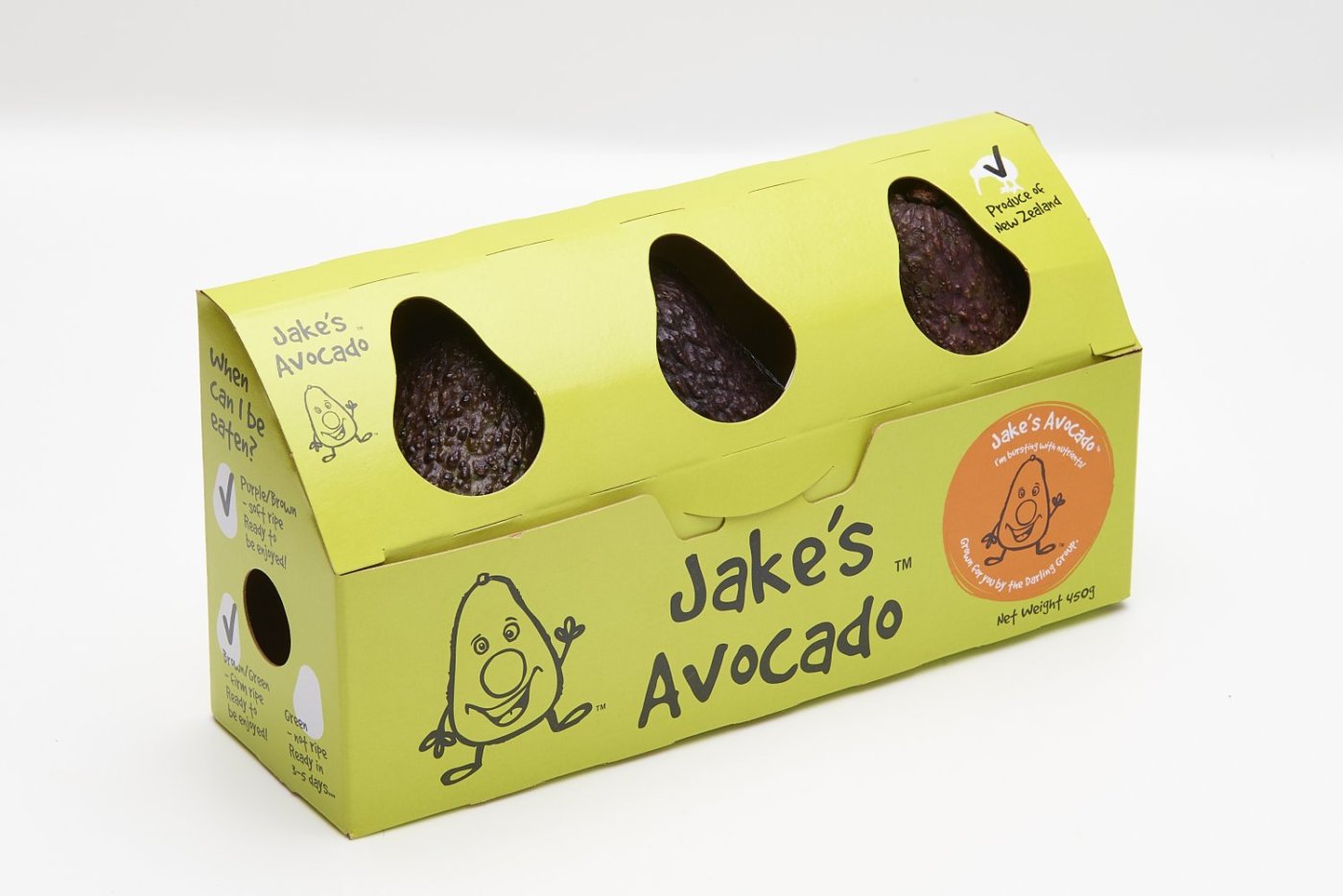
Image Source: Jenkins Freshpac Systems
Scenery
The scenic beauty of New Zealand is an integral part of the branding experience, including packaging design. Westgold is a brand that understands how to connect its product flavors with stunning landscapes. With flavors as natural as the picturesque scenery on the packages, Westgold’s design invites customers on a sensory adventure. Scenic imagery doesn’t just imply nature; it evokes the essence of natural goodness and uncompromising quality. It conveys the beauty of natural, local landscapes and ensures that every bite is an exploration of the pure taste of their natural products.
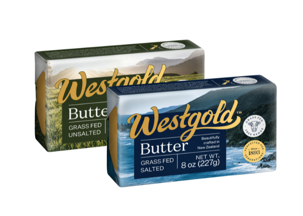
Image Source: Westgold
As a leader in free-range chicken, Waitoa embodies the essence of its local community of farmers. Their dedication to sustainability and animal welfare shines through in their packaging design. The emphasis on natural scenery isn’t merely aesthetic; it symbolizes free-range living and the sustainability of locally raised chickens in Waikato. The packages tell a story of care and respect for both the land and the animals.
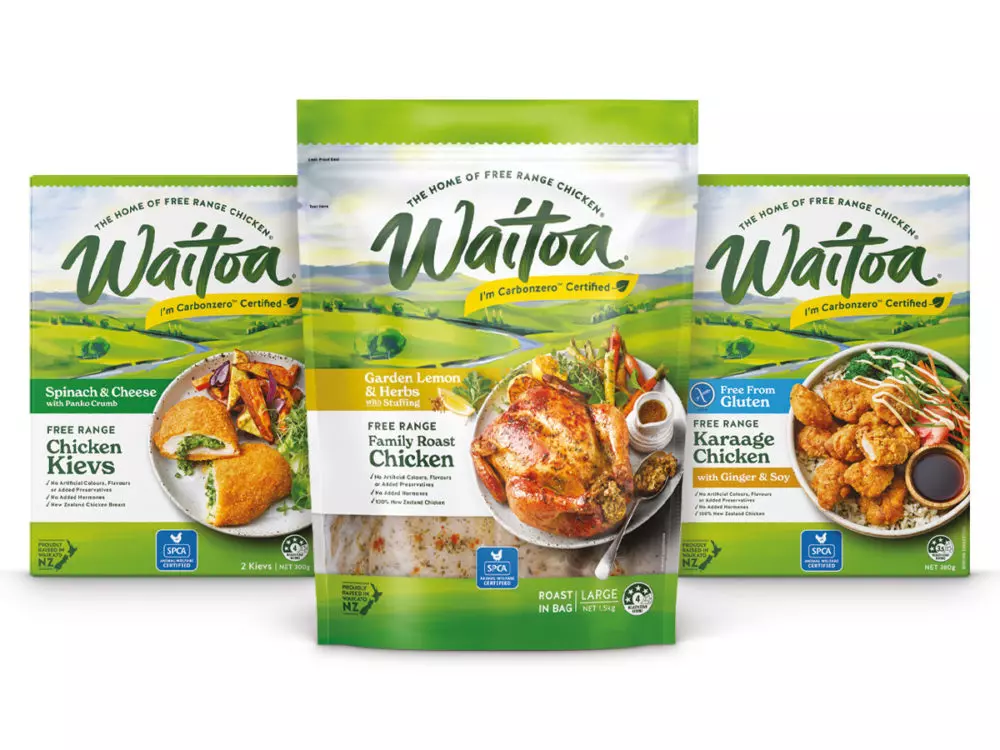
Image Source: Brother Design
THE TAKEAWAY
In our exploration of packaging design across Oceania, we’ve uncovered a world of creativity rooted in nature. These design elements leverage natural resources, echoing eco-friendliness, purity, and freshness. Illustrations bridge the gap between approachability and sophistication, making products more appealing, especially to younger consumers.
The emphasis on exceptional quality, especially for organic or healthy offerings, speaks to the confidence these brands have in their products. By showcasing the natural landscape, these designs visually connect with potential consumers, telling a story of authenticity and naturality. The packaging doesn’t just wrap the product; it embodies the spirit of the land and the people.