OH CANADA!

A refreshing summer twist on a classic.
CLIENT

Moosehead Lager

PROJECT
Moose Light Radler
RELATED SERVICE
Packaging Design
A boxed beer with a bottle and two cans, placed on a wooden surface next to the ocean.

THINK

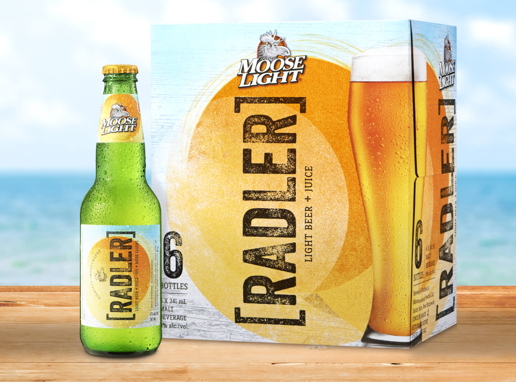
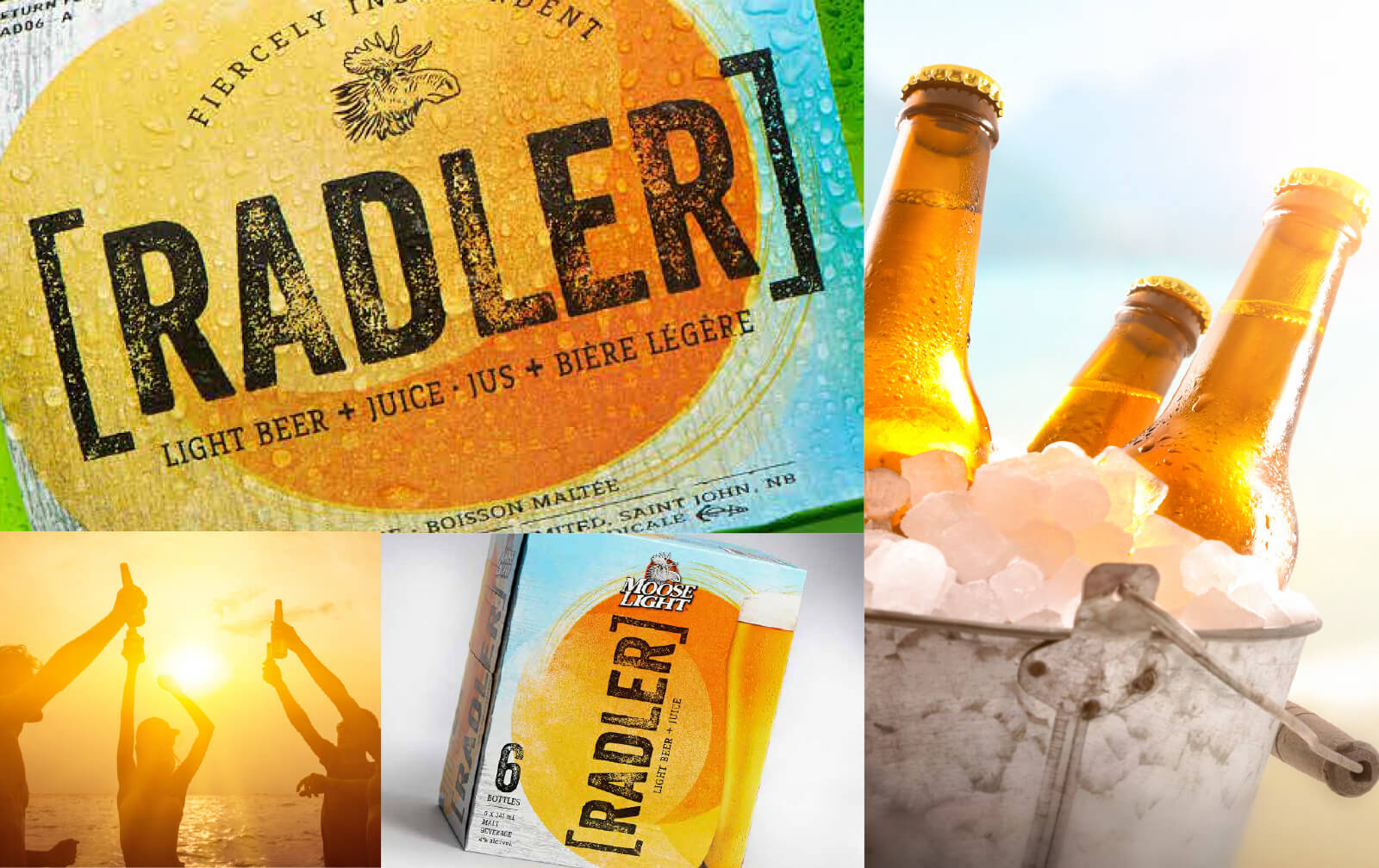
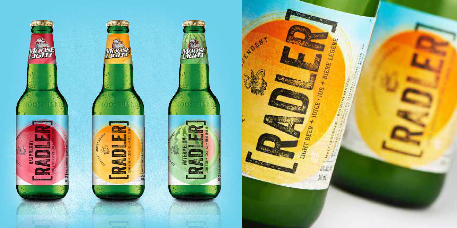
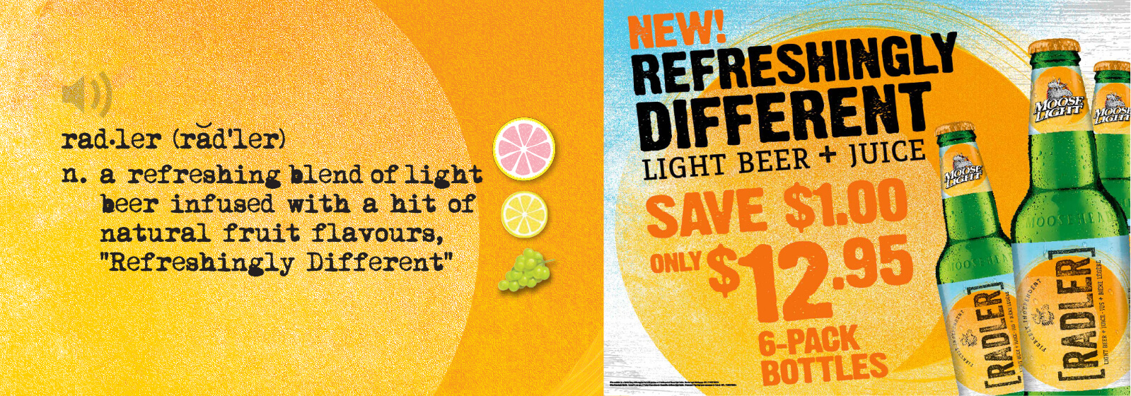
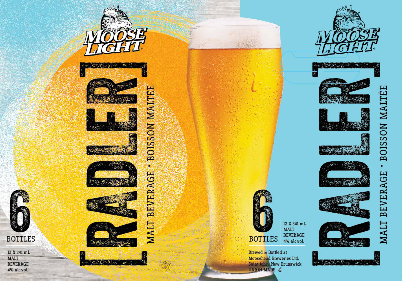
Being one of Canada’s oldest breweries, Moosehead’s iconic look and feel have carried them for generations to a brand identity that is uniquely Canadian. With the summer approaching, Moosehead wanted to capture a younger audience with a fresh, brand-new Radler for the Atlantic Canadian market. The new product needed to stand out in a market that has other Canadian brands marketing the same concepts and values.
Collage of four photos featuring beer, including a can labeled "Radler" and a bottle with the word "Kradler.

BLINK

The Radler was a new concept that hadn’t quite been experimented with in North America but was a massive success in European markets for its refreshing qualities. The distinction between a Radler and Beer was important, as this couldn’t be “just another flavored beer”. Moose light’s Radler was uniquely leveraged for its combination of juice and beer, containing 15% real juice. This distinction was a first-to-market success, tripling the company’s initial expectations.
A collage of four beer bottles, each labeled "KRALEN," with the top left bottle being a citrus flavor, and the other three being orange flavored.…
An advertisement for a beer sale at a store. The ad features a bright yellow background with various bottles of beer displayed prominently. There…
An advertisement for a beer named "Moose Light" featuring a glass of beer on the left side and text on the right.