In a world where inflation and the rising cost of living have become increasingly apparent, private labels are emerging as go-to brands for affordability and quality. These private labels, not limited to grocery chains but also found in discount retailers and cosmetics brands, offer a compelling alternative to national brands. What makes these private labels stand out is not only competitive pricing but also their skillful design of visual identity, branded house, or house of brands.
This blog will embark on a journey through the world of private labels offered by grocery chains worldwide, exploring how their unique design elements play a pivotal role in elevating brand awareness. We’ll discuss how their designs transcend product categories and their ability to cater to a wide variety of products. From packaged food to household supplies, we’ll introduce five great examples of private labels by grocery chains that have harnessed the power of brand design to their advantage.
Just Essentials by Asda, The UK
Asda’s private label brand, Just Essentials, takes a refreshing and straightforward approach. The visual identity is centered on simplicity and authenticity, reflecting Asda’s unwavering commitment to quality, even within budget-friendly options. The Asda brand name prominently stands out, underscoring that this range is something to embrace rather than hide. The vibrant yellow color evokes a positive vibe on the shelf. The clean, modern sans-serif typography implies approachability, while the playful illustrations add a friendly and humorous touch.
Just Essentials offers a wide range of value-based products, from groceries to household necessities, catering to budget-conscious consumers. Its distinct and memorable design has found a place in households across the UK, helping customers get the most value for their money. It’s a source of optimism, boldly confronting the challenges posed by times of high inflation.
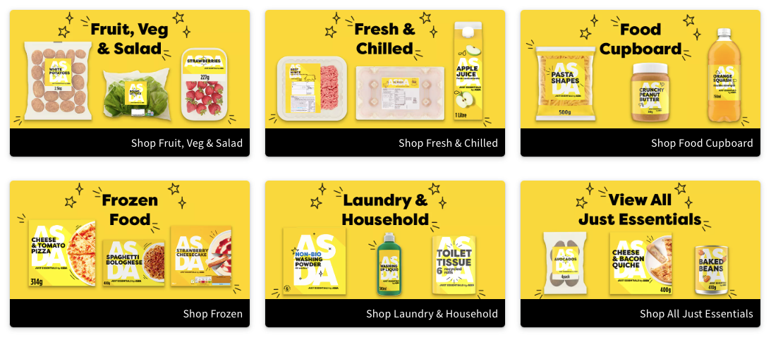
Image Source: Asda
TOPVALU by AEON, Japan
Launched in 1994, TOPVALU is a private label under AEON, one of the largest international grocery retailers in Japan. It showcases an iconic visual identity: the master brand logo features classic serif fonts and a roof-shaped emblem, conveying a sense of trust, tradition, and home. The brand’s iconic magenta color is adopted in the master logo. TOPVALU as a master brand encompasses three sub-brands: GUIRINAI in green, featuring eco-friendly and organic food offerings; BESTPRICE in yellow, focusing on budget-friendly pricing for daily essentials; and SELECT in black, emphasizing premium products.
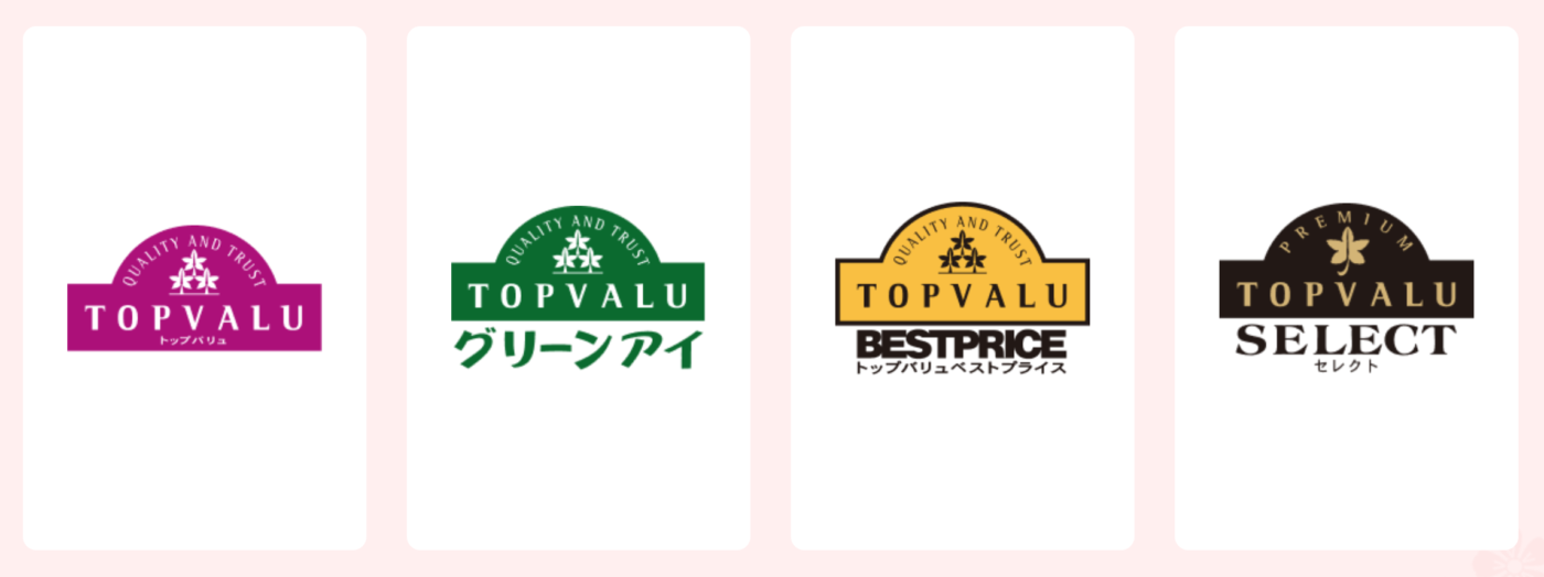
Image Source: AEON
All sub-brands carry the “TOPVALU” brand name in the same emblem, adhering to the shared values and consistent design, thus creating a cohesive brand experience. TOPVALU combines trust, quality, and affordability through its classic visual identity, ensuring a strong and consistent presence across a diverse product range.
Image Source: AEON
Giant Value by Giant Tiger, Canada
Giant Tiger is a cherished Canadian brand known for its friendly and playful vibe. Giant Value, one of its private labels, has a simplified and modernized logo featuring a prominent checkmark, a symbol of everyday savings capable of attracting younger customers.
The packaging structure can span across the entire product range, from plastic wrap to tomatoes and garlic powder. Different colors can be adapted to a wide range of packaging, be it pouches, cans, or cartons, all while aligning with the brand’s lively and positive spirit. The clear and straightforward imagery, combined with the bold logo against a clean white background, creates a striking presence on store shelves. Giant Value embodies quality, affordability, and the joyful essence of Giant Tiger, offering a fresh and hassle-free shopping experience that suits the needs of budget-conscious customers.
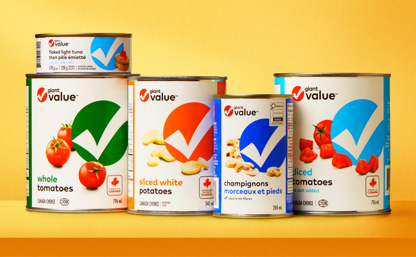
Image Source: SLD
365 by Whole Foods Market, The USA
365 by Whole Foods Market has a simple yet impactful design, focusing on making shopping easy and enjoyable. The color palette is vibrant but natural, adding a touch of joy to the grocery shopping experience. The typography is clean and straightforward, providing clear product information without any clutter while focusing on product imagery. The design is also appealing because of the bold, nature-inspired illustrations, such as the fruits and nuts. They add a playful look and feel, which also reminds customers of Whole Foods Market’s commitment to the environment. The design is simplistic yet warm, echoing the brand’s dedication to organic and wholesome living.
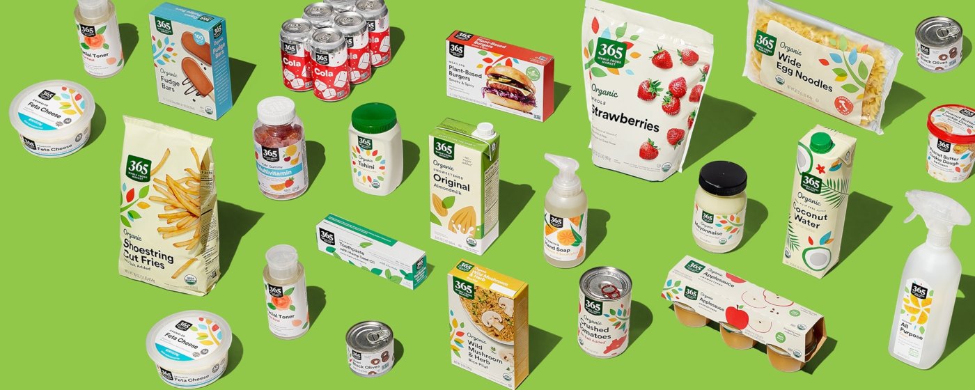
Image Source: Whole Foods Market
Allerslimste Koop by Jumbo, The Netherlands
One of the most popular private labels by Jumbo is Allerslimste Koop, which means “Smartest Buy” in English. Its brand design sheds light on simplicity and visual impact to resonate with its customers. Rooted in the philosophy of offering products with “top quality for a Dutch price” (Topkwaliteit voor een Hollands prijsje), Allerslimste Koop adopts the iconic black and yellow color scheme, creating a seamless and cohesive connection with the overall Jumbo brand.
The introduction of the yellow “badge” to the existing private label packaging is a stroke of brilliance, making the value-packed products immediately recognizable for shoppers. This eye-catching design element is not just confined to packaging design but also various advertising materials, from promotional flyers to marketing copies. Echoing Jumbo’s logo, Allerslimste Koop boldly underlines the message of savings and value, ensuring that it is the best choice for budget-conscious Dutch shoppers who don’t want to compromise on quality.
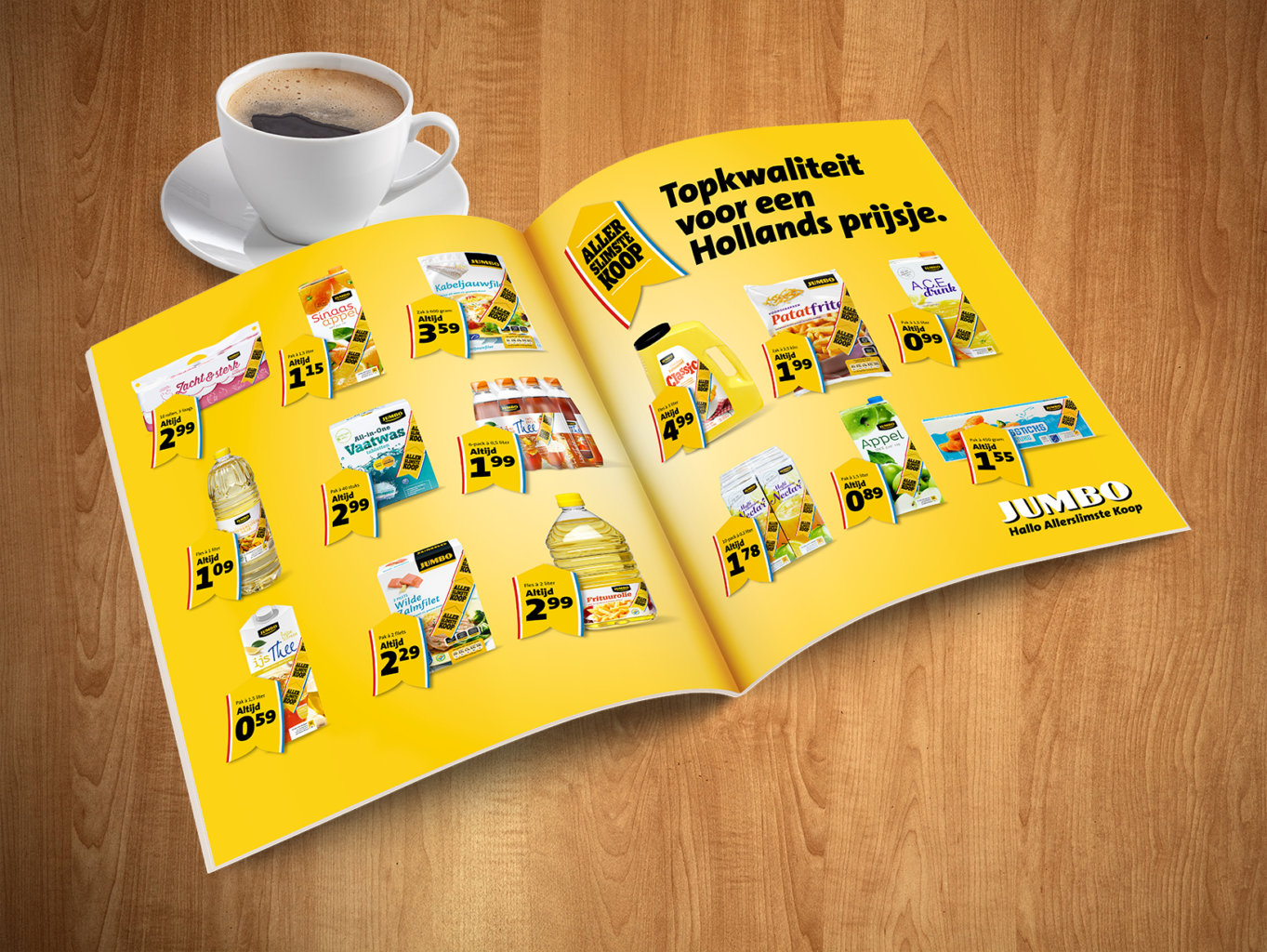
Image Source: Jumbo
The Takeaway
In today’s world of retail, we can see more and more private labels taking place on the stage, with the series ranging from premium or organic to value or essential. In the CPG space where value and quality converge, a versatile visual identity is the key to success. It guides savvy shoppers through the aisles, reassuring them that they’ve made the smartest choice.
Aesthetics is not the only criteria as the brand design needs to adapt to an array of products, be it salad dressing, canned vegetables, or garbage bags. It also needs to symbolize guarantee and trust, encapsulating a brand’s commitment to quality and affordability for its customers. Eye-catching or even bold elements can be embedded in the visual identity that resonates with in-store grocery shoppers, such as Giant Value’s checkmark by Giant Tiger and Allerslimste Koop’s badge by Jumbo. This easy recognition helps create a bond between the brand and the customers. When they see a familiar design element, they know they are making the right choice — a choice that helps save money without compromising quality. A flexible, eye-catching visual identity for a private label doesn’t just enhance the product packages; it’s the embodiment of brand trust and loyalty.