Consumers may find it difficult to navigate the aisles of a grocery store, and trying to find the right product may feel like a game of Where’s Waldo? Consumer purchasing decisions are frequently influenced not by the name of the brand or the price of the product, but by the packaging in which the product is sold. With so many options available, how can you ensure that your packaging stands out?
The font you choose for your packaging may be the most effective way to capture attention and communicate your message in an interesting and creative manner. Typography, among other things, can define your product, help differentiate your brand, and influence customer preference. Typography is both an art and a science, and it is an essential component of any packaging design. However, it is not as simple as simply selecting a typeface or font that you like.
Here are some things to think about when choosing a typeface and font for your packaging.
Know Your Audience
Knowing who your target market is will help you decide which path to take. The font and typeface on a package can convey the idea that you want your audience to receive even before they have processed what they are reading.
The right typeface for an energy drink aimed at Millennials, for example, may not be the right typeface for a low-calorie fruit drink aimed at an older demographic. It is critical to conduct preliminary research and allow your findings to guide your decision on the appropriate font.
Packaging Shape And Size
Other factors that can limit or enable your packaging typography include the shape and size of your product. A cereal box, for example, has far more text space than a tea canister. When designing your packaging, make sure the words are visible and legible so that customers can quickly find what they’re looking for.
By incorporating a sense of balance and symmetry into your packaging design, you can create something visually appealing while also making your customers’ lives easier. Our most recent Quaker designs made use of prominent typography to ensure easy customer recognition.
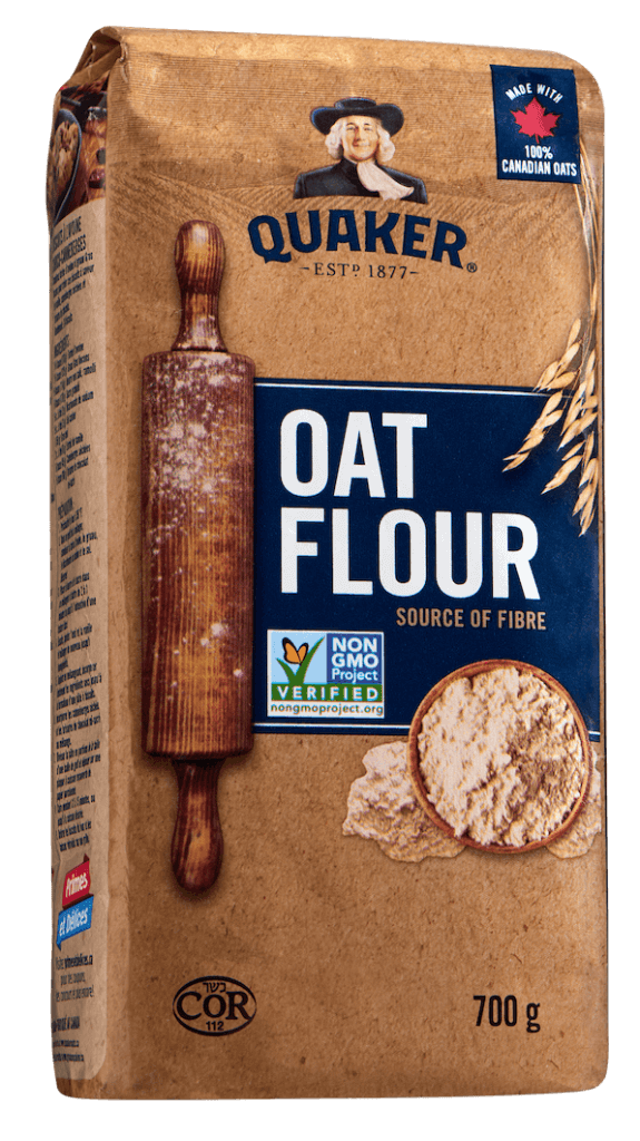
Image Source: SLD
Typeface And Font
There has been a lot of research done to determine what works best in different situations, from the kerning between your letters to whether you should use a serif or sans-serif font. While your target audience and packaging size will help you narrow down your options, there are a few general guidelines to follow:
- Less is more: While it may be tempting to include a lot of text or different fonts in your packaging fonts, doing so can result in a cluttered and confusing design. You can walk the line between contrast and consistency by using slight variations of the same typeface.
- Upper and lower case versus all caps: The human eye recognizes letter characters more easily when upper and lower case are used together. This can help customers absorb the information they are reading more quickly.
- Color Considerations: Positive type (dark text on a light background) causes the background to expand in the eye, making letters appear smaller than they are; reversed type (white text on a dark background) has the opposite effect, making letters appear larger. This can be a great way to maximize space when dealing with smaller packages.
Typography Trends And Typography Packaging Design
Handwritten fonts, minimalist styles, vintage, retro, cutouts, and overlays: these are all typography trends that you have most likely seen before and will continue to see in the future.
While there is nothing wrong with using a popular style that may resonate with your customers or look good in a social media photograph, keep in mind that the typeface and fonts you choose must correspond with the product you are attempting to sell. If they don’t, it will come across as fake and will ultimately do more harm than good.
Typography in packaging, like many other aspects of design, does not have a one-size-fits-all solution. What works well in one situation may not work in another, and the creative process that takes place behind the scenes can be time-consuming and labor-intensive. Having said that, it is critical to treat typography as a fundamental component of your packaging design. When done correctly, it has the potential to transform the face of your entire brand.