Standing out on shelf is one of the key factors that will determine the success of a package design. However, with so many products competing for the consumer’s attention, it’s becoming harder to stand out. Whether designing for a well-known product that already has cachet, or introducing an entirely new offering, it’s critical that a product commands attention. Here are four ways brands can utilize disruptive design and draw the eye to their product:
1. Color
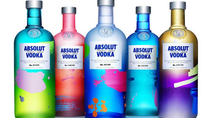
This is an easy tactic in terms of delivery. It is the least expensive and allows for a wide range of options. But to really disrupt using color, brands need to go farther than ever before. Simply going against the category convention does not guarantee success. Consider these designs for Absolut Vodka — in a category where most bottles emphasize the clear, crisp vodka flavor by using white, grey, black and gold, Absolut has boldly stepped so far outside this convention it’s impossible not to take note. Their limited edition bottles explore everything from psychedelic colors to pop stars to cultural references, all in bold, eye-catching color. By utilizing the brand’s unique bottle shape with the silver cap and the strong wordmark, the designs are still recognizably Absolut branded. By using their simple bottle as a canvas, the brand can cleverly adjust as other brands attempt to edge in on their color strategy.
2. Shape
Uniquely shaped bottles, boxes or bags can be more costly, but can provide a huge advantage when it comes to visibility on the shelf. Method is a brand that rocked the category by branding their line of environmentally friendly cleaning and beauty supplies in slightly unusual bottles. Quirky cartons and boxes inspired by origami, puzzles and the shape of the product itself are popping up everywhere. Some products are making their package beautiful enough to earn a permanent spot in the house after the actual product is gone. Although for many CPG brands the cost of a unique shape may seem prohibitive, if the end result will be a huge increase in marketshare, it may be worth considering. Even a simple cardboard canister shape can lift sales if the entire category is in flat boxes.
3. Clever
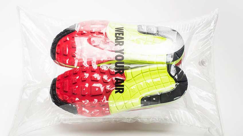
Some of the most disruptive package design is appealing because of a sense of play that is immediately engaging. Thelma’s cookies come in a box that looks like an oven, which pops open with freshly baked cookies sliding out. Nike packaged their famous “Air” sneakers in a clear air bubble. Cost for this kind of disruptive design can vary significantly, but the key is to provide a fresh, playful perspective that will amuse consumers. This can be an excellent way to engage customers with commodity items such as shoelaces and tissue paper.
4. Functional
The future of package design might be in creating a multi-purpose use for the package. Not only does this speak to consumer’s desire for a more eco-friendly design, but it extends their experience with the brand. Paper wraps with embedded seeds are a simple example, while other brands have inserted VR goggles and projectors into their package design. Foodservice brands are creating take-out containers that are carrying cases (removing the need for a plastic bag) that fold out into clever serving trays, complete with utensils.
There is room for a lot of innovation in this area, and we expect to see this trend grow. If you are considering a disruptive package for your product, the only limit is your imagination — and your budget. Creating a stand-out design will cost more, especially if you are considering some unusual structural elements or a completely new format. For new products the investment can potentially be the difference between success and failure. For established products, it’s important to consider the market dynamics before making a radical shift. If your product is struggling, a unique structure or innovative function might be worth the investment. It’s important to ensure a new design doesn’t confuse consumers – Absolut’s tactic of using color but keeping their bottle shape and wordmark is on point. With so many brands taking bigger risks, there has never been a better time to be bold.