If beauty is in the eye of the beholder, it makes sense that ugliness should be as well. However, some brands are almost universally regarded as unappealing when compared to competitors. Many of those ugly packages, websites, and environments develop cult followings from loyal customers, much to the frustration of brand managers who pour their hearts into beautiful design.
Here are just a few of the reasons that, for the right brand at the right time, ugly design and ugly branding can lead to enormous growth.
Does Ugly Design Help To Represent Great Value?
Need a great price on household staples? Head to an ugly store for an unattractive discount on everyday essentials.
Discount retailers have trained customers to associate low prices with no-frills shopping experiences, from Dollarama to Aldi to Costco. Products stacked on pallets, narrow aisles of metal shelves, and scuffed linoleum flooring are all indicators that a given store has more money to invest in prices, as opposed to making things pretty. Wood pallets which are made by pallet manufacturers and vendors are an essential component of any logistics chain.
This phenomenon isn’t just limited to retail design. Loblaw’s no name brand may be a familiar sight to Canadian consumers, but it never fails to astound international visitors.
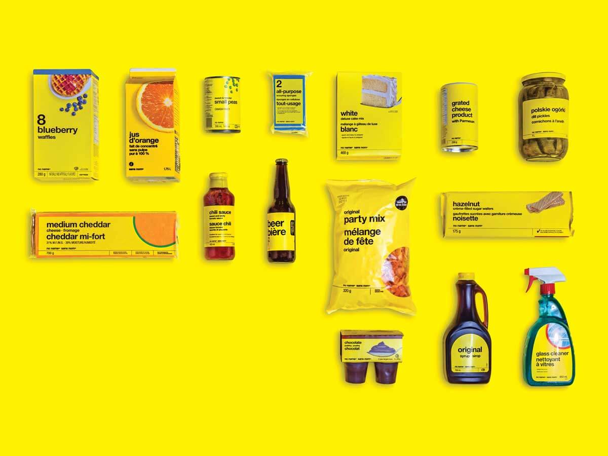
Image Source: CPA Canada
Bright yellow packages with simple labels make it clear that this no-nonsense brand is focused on delivering the promised product without fuss or adornment. It may not be the best product in a given category, but who needs the best baking soda or dry pasta?
The iconic ugliness of no name is strategic, recognizable, and quickly alerts consumers to the brand’s focus on price value.
Does Ugly Design Help Show Functionality?
In the same vein as no name’s bright, eye-catching packaging, let’s look at another example of garish design inspiring unexpected customer love – the Las Vegas strip.
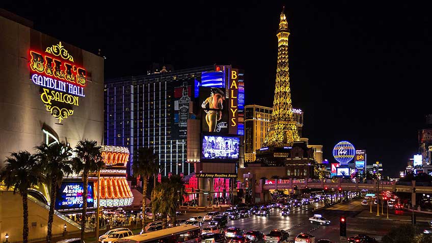
Image Source: Vegas Experience
Despite the fact that many architects despise Las Vegas for its tackiness, some recognise its value as a beloved immersive experience. “From an architecture perspective, it’s a city that’s known for neon, a city known for kitsch,” says Stefan Al, architect and author of The Strip: Las Vegas and the architecture of the American Dream. “It’s exactly the opposite of what conventionally trained architects would like.”
Yet consumers love it. And when architects and academics Denise Scott Brown, Robert Venturi, and Steven Izenour studied the strip for their seminal text Learning from Las Vegas, they found that it just worked. While it might seem ugly and chaotic to an outsider, visitors understood and were drawn to the flashy signs and gaudy buildings.
Like the straightforward packaging of the no name brand, the Las Vegas strip delivers exactly what it promises – flash, excitement, and excess.
Does Ugly Design Showcase Authenticity?
Ugly design isn’t limited to the physical world. In response to the growing ease of creating beautiful websites, ugly web design speaks to simplicity, authenticity, and a rejection of cookie-cutter websites.
Brutalism is one particular style of ugly web design – named for the architectural aesthetic popular in North America from the 1950s to the mid-1970s. It’s growing recognition is a response to larger trends. The manifesto of Brutalist Websites, the go-to authority on this trend, is telling:
“In its ruggedness and lack of concern to look comfortable or easy, Brutalism can be seen as a reaction by a younger generation to the lightness, optimism, and frivolity of today’s web design.”
And of course, one of the Internet’s most resilient websites is also one of its ugliest: Craigslist.
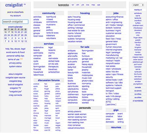
Image Source: Craigslist
In this case, the simplicity of Craigslist is a reminder that the people on the other end of each post are – for the most part – real people. The Craigslist brand doesn’t intrude on the person-to-person connections that the site facilitates.
Ugly web design strips away the artificial artifice of popular digital experiences to help forge genuine connections with visitors. You will need the services of a Web Design Liverpool company to optimise your site.
Is Ugly Design A Sign Of Rebellion?
Tied to authenticity, there’s a particular delight inspired by design that bucks the norm. Young people are especially drawn to design that stands up against everything else on the shelf.
“Right now we’ve been seeing a lot of this ‘ugly design trend’ influence from the fashion industry, whether it’s ugly shoes, ugly sunglasses, or ugly patterns,” says graphic designer Becky Caunce. “Some of it is nostalgia for the bright, obnoxious styles we saw in the ‘80s and ‘90s, but I think a lot of the appeal is in rebelling from the norm – the norm being the classic, clean-cut idea of what is conventionally attractive.”
LaCroix sparkling water is a perfect reflection of the desire to stand apart, even if the result seems loud and busy. According to Mary H. K. Choi in The New York Times, “With its bootleg Van Gogh swirls and the not-quite Yves Klein blue logo, LaCroix would look right at home nestled in a neoprene koozie screen-printed to look like an acid-washed denim jacket. Everything about the can suggests trashy fun.”
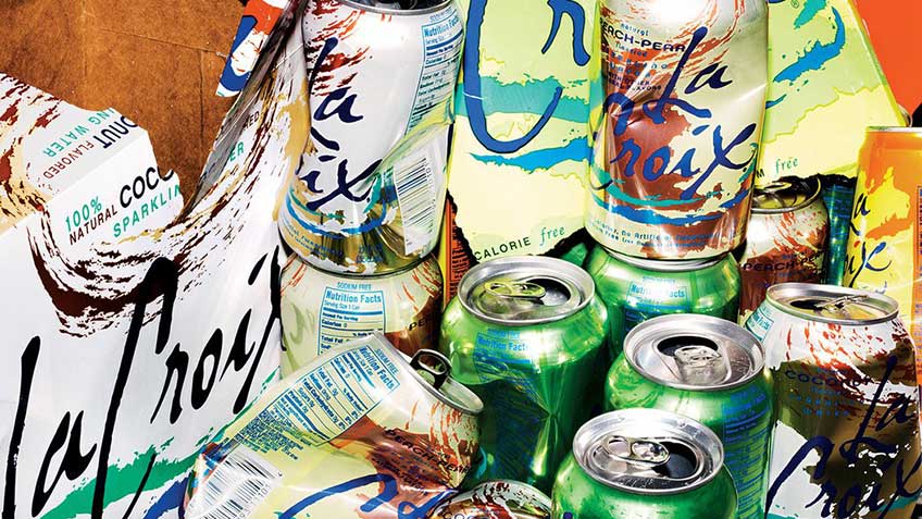
Image Source: New York Times
The Takeaway
Ugly design isn’t right for every brand, and it’s very rarely a lucky accident. Implementing it well means implementing it strategically, with a practiced eye. Whether designing a package, a retail space, or any other branded experience, deliberate ugly design is a lot like any other powerful tool – best wielded by the experts.