Rebranding a non-profit organization or charity offers a strategic opportunity to realign the visual identity with its core vision and mission. Through a thoughtful system with design elements such as wordmarks, icons, and color palettes, the brand can effectively communicate its values to stakeholders in a visual manner.
In this blog, we’ll use five successful rebranding examples to discuss how modernizing the brand can increase its relevance to target audiences, fostering a stronger emotional connection and visual engagement.
BENEFIT #1: INCREASE BRAND RELEVANCE AND AWARENESS
Through strategic changes in brand messaging, visual identity, and even the brand’s name, non-profit organizations or charities can effectively communicate their values and scopes of work, enhancing their resonance with stakeholders and the broader community.
For example, Tinnitus UK’s rebranding strategy involved a revolutionary approach to modernize its brand image and increase relevance to the public. By shortening and modernizing its name from “British Tinnitus Association” to “Tinnitus UK” after 44 years, the brand moved beyond the perceptions of being old-fashioned and now presents itself as dynamic, down-to-earth, and forward-thinking.
Moreover, Tinnitus UK refreshed its color palette, featuring a range of pastel colors. This change ensures accessibility for those with visual impairments and also conveys a sense of approachability and compassion. This considerate brand design allows its marketing materials to be more visually inclusive, helps to evoke positive emotions, and fosters stronger connections with its target audience, including donors and service recipients.
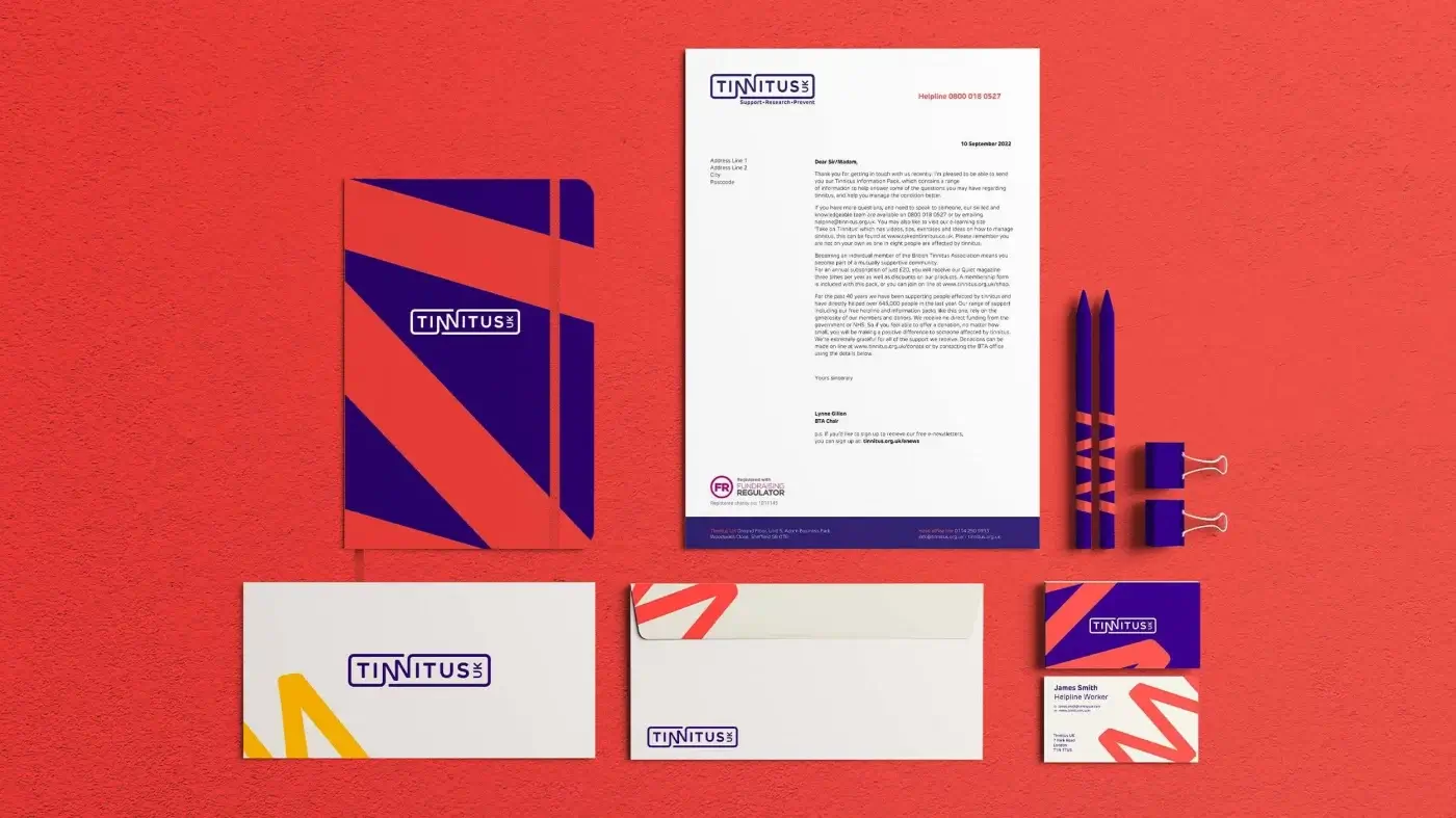
Image Source: Missouri Creative
In Canada, Achēv’s rebranding efforts were driven by a desire to align the brand image with its impactful work in delivering employment, youth, newcomers, language, and youth services. Its new name, Achēv, was adopted for its aspirational connotations that emphasize the power of individuals to achieve their life goals. This powerful messaging is further reinforced by a logo featuring an “A” symbol, that can be interpreted as a mountain or directional marker, symbolizing the challenges being overcome on the path to success. By communicating a clear and compelling message of empowerment and progress, Achēv’s rebranding initiative positions it as a leader in its field.
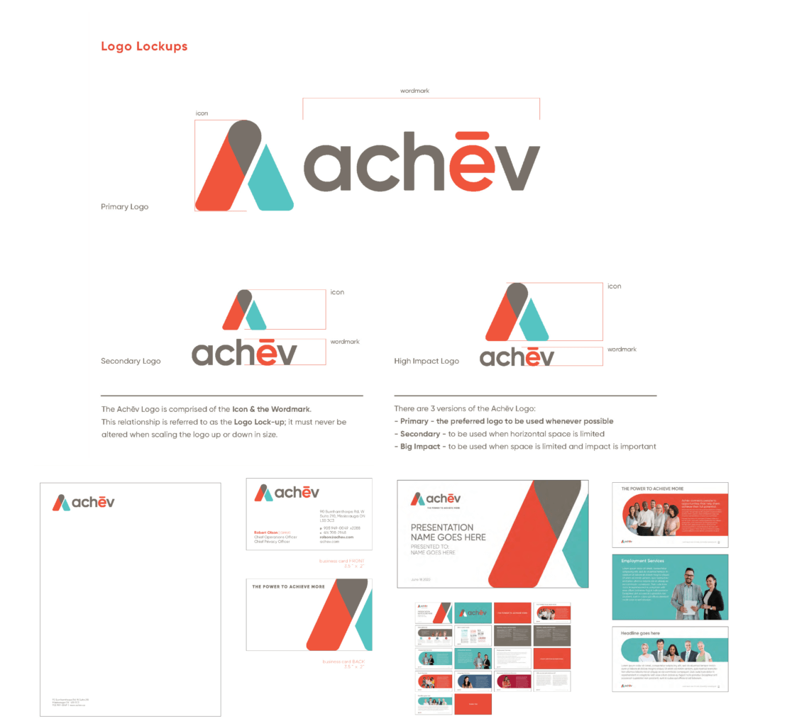
Image Source: SLD
BENEFIT #2: IMPROVE STAKEHOLDER ENGAGEMENT
By creating a cohesive and compelling brand identity that resonates with the target audience, rebranding a non-profit organization or charity can greatly facilitate stakeholder communication and engagement. In the rebranding efforts of Eikon from the UK and Starlight Children’s Foundation from Australia, thoughtful design elements are employed to convey warmth, accessibility, and a sense of purpose.
Eikon’s vibrant and welcoming rebranding specifically adopts youthful cues to create emotional impact. The color palette includes several “highlighter pen” shades, while handwritten-style fonts bring about a youthful and dynamic vibe, mimicking journal writing as a whole. These design choices convey a sense of approachability and friendliness, emotionally connecting stakeholders with Eikon’s vision and mission. Also, the use of quotation marks to hold photos or copy serves as a handy communication template, making cohesive content creation easier.
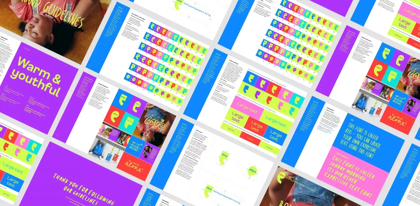
Image Source: IE Brand
The rebranding of Starlight Children’s Foundation centered around the theme of “stars”, which serve as a powerful storytelling device. By owning the star in its logo, icons, and image frames, Starlight Children’s Foundation created a cohesive and recognizable brand image. By communicating the message of bringing joy and hope to sick children and their families, Starlight Children’s Foundation can foster stronger connections with its stakeholders, ultimately leading to more volunteer and fundraising support for its cause.
User-friendly brand guidelines help ensure consistency across all communication channels, empowering colleagues and partners in public relations, communications, and fundraising roles to convey coherent messages to donors and communities. Done well, brand guidelines can reinforce brand values and reduce the need to align messages.
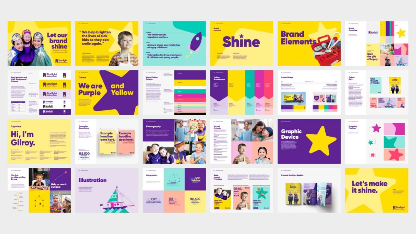
Image Source: Hulsbosch
BENEFIT #3: ENHANCE UNITY AND COHESION ACROSS SUB-BRANDS
Aligning the visuals among sub-brands under the same brand can enhance the overall visibility. For instance, the Child Development Institute (CDI) in Canada has successfully transformed its brand to unify four sub-brands under one master brand. The master brand’s role is an endorser which empowers the four sub-brands to improve their visual presence.
Additionally, the sub-brand logos retain their unique elements but still align with the master brand’s overall color scheme. This cohesive visual identity system not only creates a recognizable brand umbrella but also reinforces CDI’s values and commitments across its diverse range of services. Through strategic rebranding, non-profit organizations or charities can simplify their messaging and enhance stakeholder recognition, fostering greater trust within the communities.
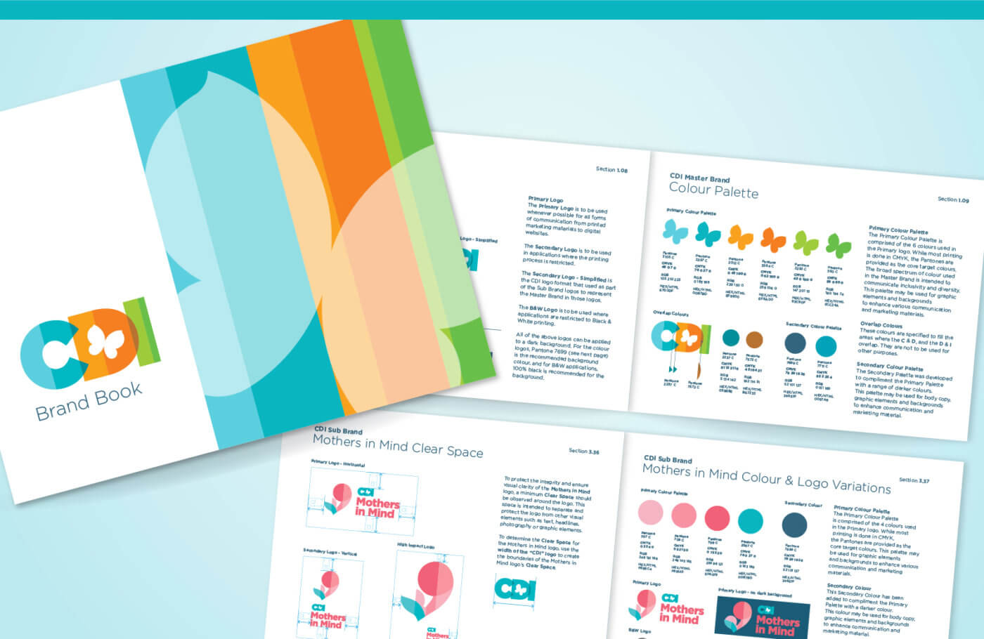
Image Source: SLD
THE TAKEAWAY
Rebranding a non-profit organization or charity can harmonize the visual identity with its values, facilitating PR, marketing, and fundraising duties, as well as enhancing brand recognition. It’s important to communicate the benefit to society, and also to build credibility through your brand design.
Stakeholder engagement, such as focus groups and surveys, may offer crucial insights into perceptions and expectations, which, in turn, inspire and guide design rationales. Aligning the visual identity with stakeholder sentiment ensures resonance and supports the non-profit organization or charity in making a meaningful impact on society.