Energized designs give unity and a new life to a family of brands that provide mental health assistance to children, youth, and families.
CLIENT
Child Development Institute
PROJECT
Child Development Institute Rebranding
RELATED SERVICE
Brand Design
THINK
CDI is a world-class leader in helping children, youth, and families develop life-long resilience through a wide range of evidence-informed services in mental health, early learning, and well-being.
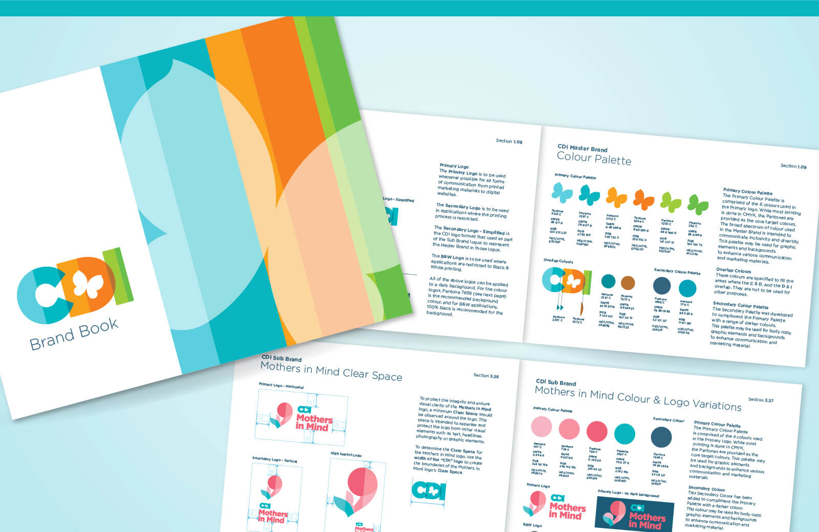
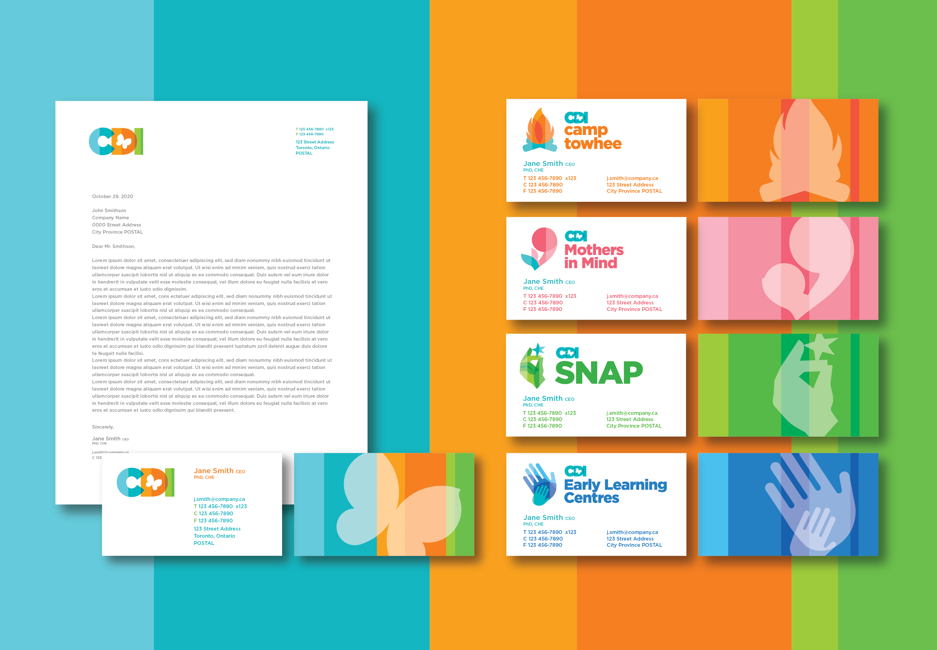
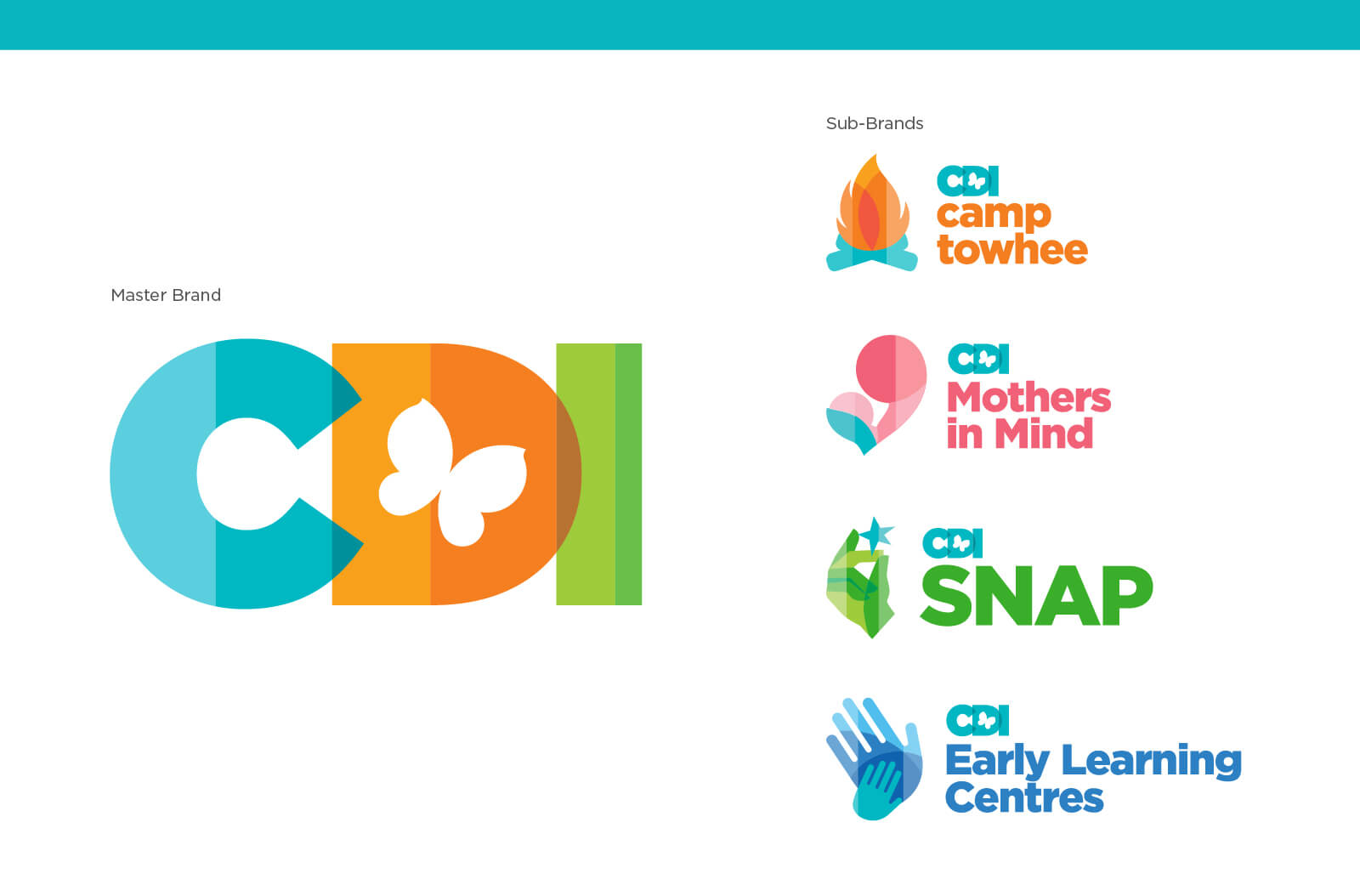
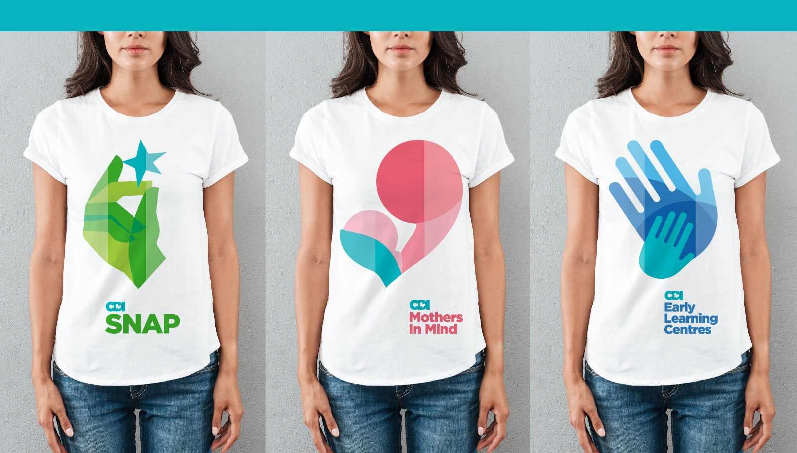
The project goal was to develop a cohesive design system that unifies a family of 4 sub-brands under one master brand. The role of the CDI master brand is that of an endorser, enabling the sub-brands to achieve a strong visual brand presence for their intended audiences. For all the branding elements, the initiative had to communicate CDI’s commitment to transformation, change, and creating hope and compassion in their communities.
BLINK
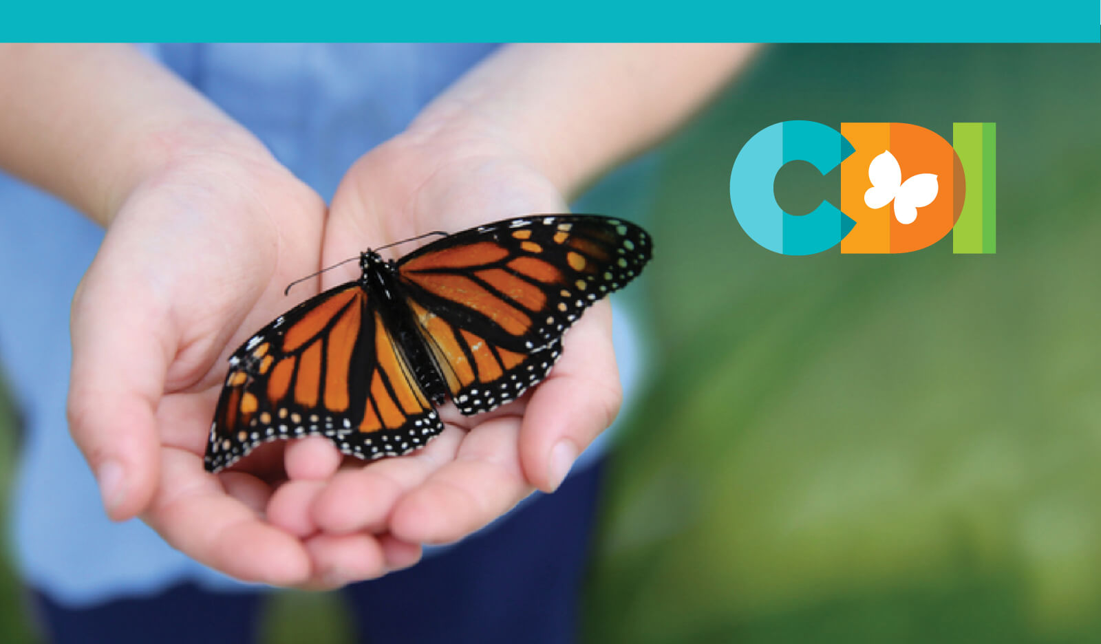
The butterfly in the new logo represents transformation, hope, and life, with the life cycle representing the positive change that CDI brings to its communities. The logo’s color separation represents a bar graph, emphasizing CDI’s commitment to being evidence-based and data-driven.
Sub-brand logos were created under a similar umbrella after configuring the main CDI brand. The logos used colors from the main brand while retaining their uniqueness. Combined, CDI had a recognizable brand umbrella, uniting their sub-brands under the common banner while emphasizing company values and commitments.