Moving toward recovery and care, Nestlé Canada needed a cohesive package design that spoke to wellness
CLIENT
Nestlé Canada
PROJECT
Nestlé Health Science Canada
RELATED SERVICE
Packaging Design
THINK
With a full portfolio of health products, creating a unified brand presence that didn’t sacrifice the identity of individual products was a challenge. Nestlé’s comprehensive range of health solutions was being shifted to a new target market and had to reflect this in the design.
With the new position came a new identity. The new master brand design had to be cohesive while still representing the characteristics of each product and brand, exemplifying the change in the target market while retaining the brand equity of Nestlé.
BLINK
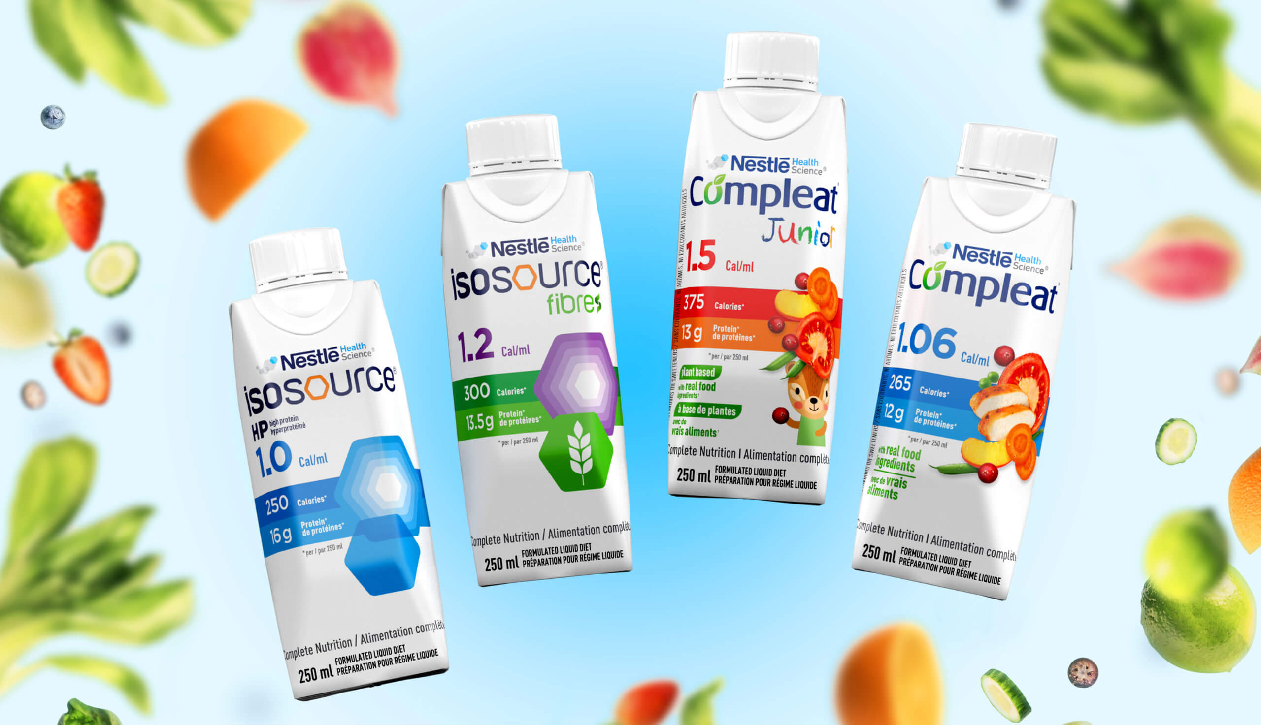
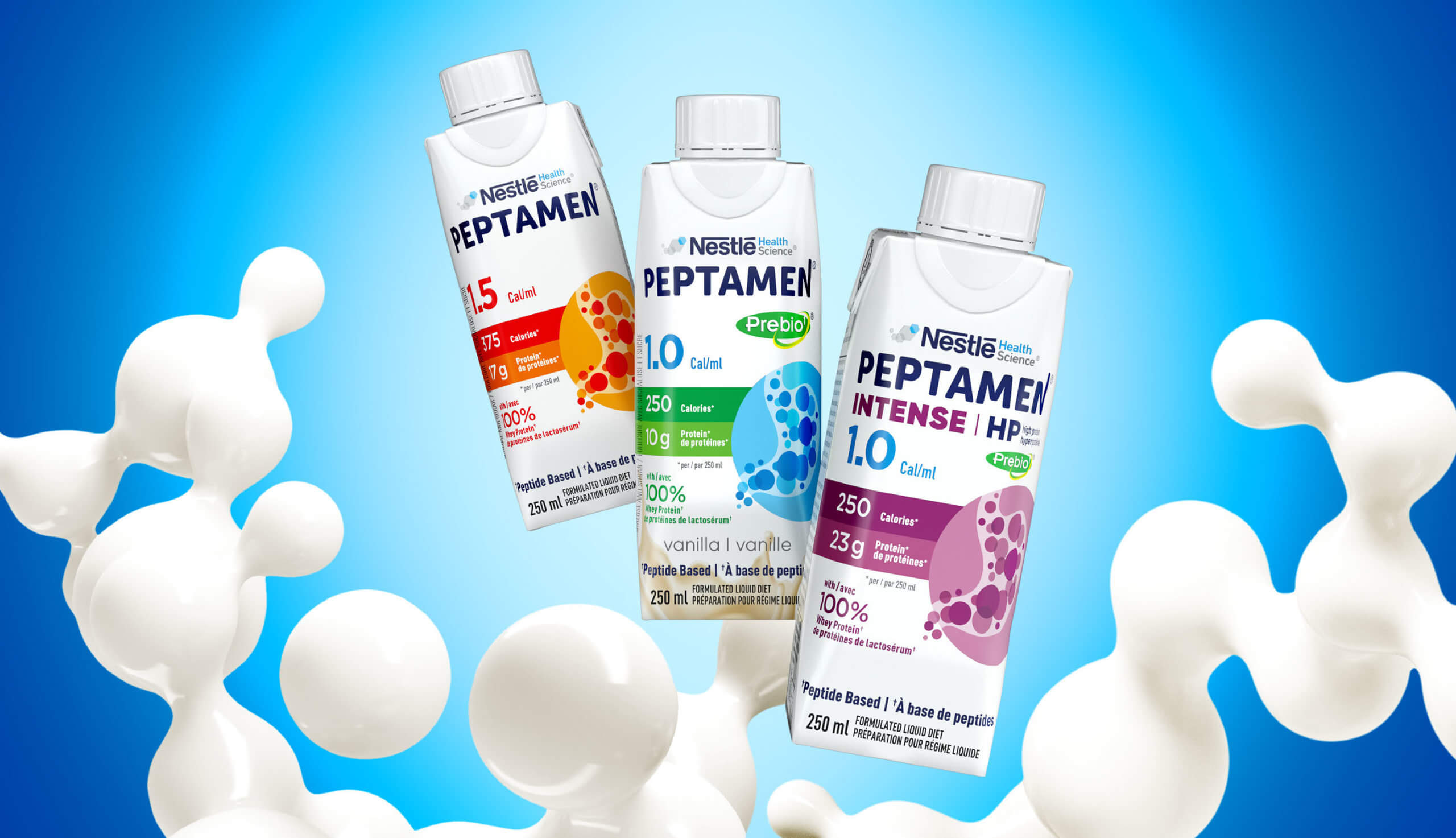
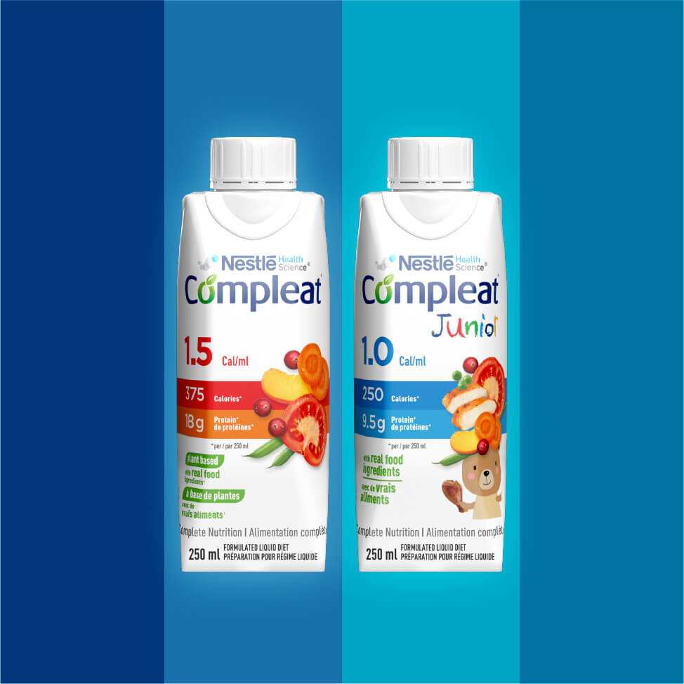
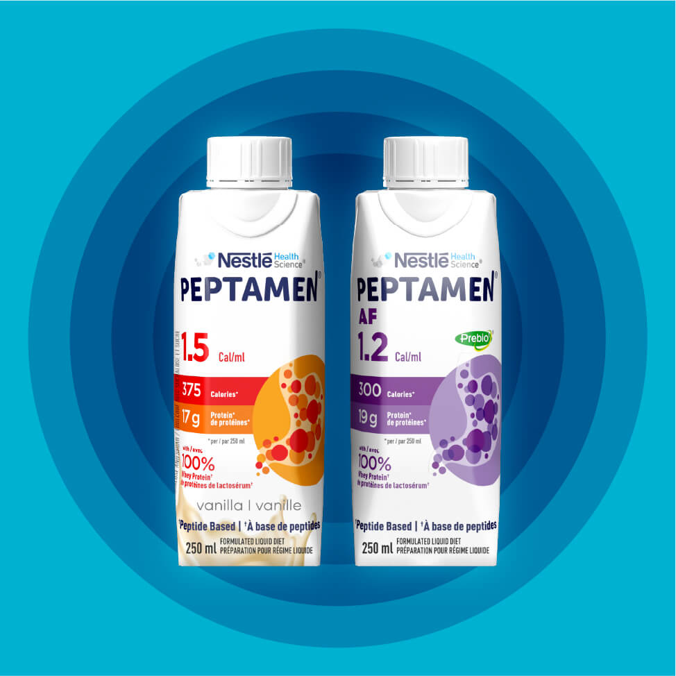
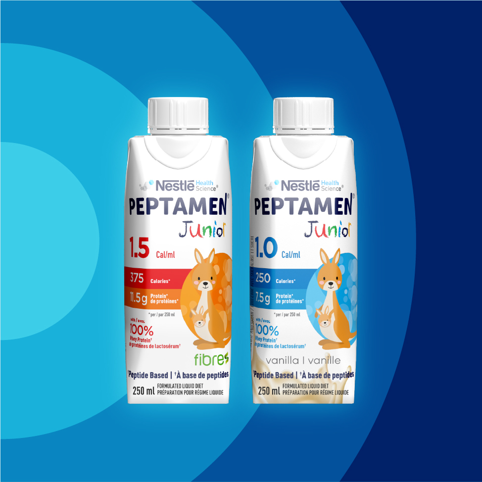
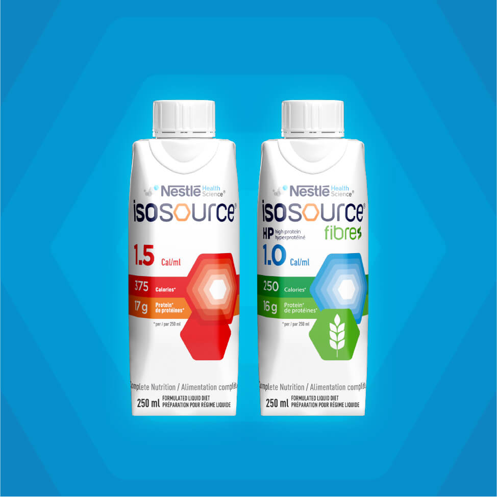
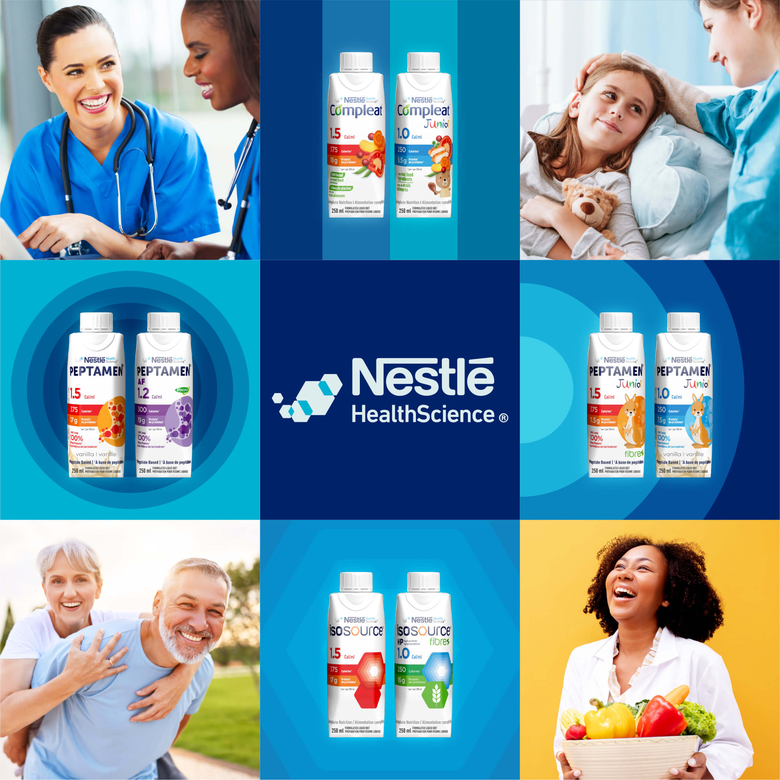
The new design spanned 13 different brands, creating individual profiles for each while maintaining a master brand equity and an overall unified brand presence. Nutrition callouts were much more prominent in the new designs, with key nutrients like protein, fiber, and calories in the middle of the design communication hierarchy.
A new revamped color-coding system was developed to bring more differentiation between products, for easy recognition and visual clarity. The new format delivers consistency in tetra pak and label packaging that is grounded in white, allowing colors to shine. The new design for all 55 SKUs is currently supporting customer wellness journeys in pharmacies across Canada.