Holidays and seasons are key occasions in the fast-paced world of retail, defining consumer wishes and expectations. Packaging undergoes a transformational trip from the scorching days of summer to the ominous ambiance of Halloween and the heartfelt joys of the holidays. It transforms into a canvas on which designers artfully weave the essence of the season in order to grab attention and elicit festive emotions with an instantaneous emotional connection. Consumer packaged goods (CPG) brands, however, present a sensitive problem amid this creativity. It is critical to strike a balance between enjoying the festive spirit and maintaining corporate identity. In the enthusiasm to celebrate, businesses can sometimes lose their distinctness, failing to stand out among the bright array of festive products.
In this blog, we will look into the art and science of seasonal packaging. We uncover the success stories through real-world examples, showcasing the brands that skillfully managed the seasonal packaging landscape and providing useful insights to CPG brands seeking to master the subtle art of seasonal packaging. Join us on this visual and conceptual journey as we uncover the secrets that transformed ordinary packages into exceptional feats of design that captured not just the eyes but also the hearts of consumers in the blink of an eye.
Moosehead: Summer Series
Aside from the holiday seasons, the summer season has become an important time of the year for brands to release their creative summer packaging ideas. Moosehead Breweries wanted to encapsulate that in a uniquely Canadian way. Being Canadian was part of the brand, and the company went with the summer packaging that was targeted towards the market.
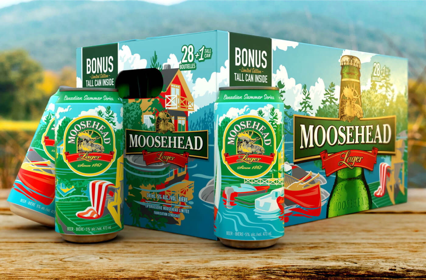
Image Source: SLD
The package design was exclusive to the Canadian market and was implemented on both cans and cartons. The imagery depicts the joys of Canadian summers, including docks on a lake or cottage country with canoes and lots of trees. The connection between the two goes beyond that of “just packaging” and tells a story that almost every Canadian can resonate with. Creating personal connections to both products and brands can go a long way in creating customer loyalty and telling stories with deeper meanings that resonate.
Cheetos: Ketchup Leaves
Holidays are an important part of cultures around the world. They are sometimes celebrated with a myriad of fireworks, and family and friends gather together. When creating packaging for celebrations like this, marketers and CPG brands need to consider the unique cultural elements.
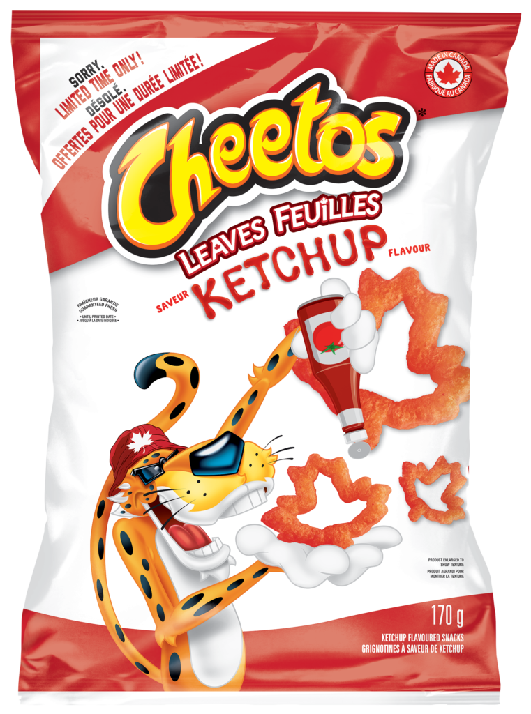
Image Source: SLD
Sometimes, the design can connect closer to a unique aspect of the country rather than complex designs. In the case of Cheetos, they leveraged the Canadian uniqueness of the Ketchup flavor while adding some clever design elements to deliver a uniquely Canadian package, including the red and white color scheme for the packaging to echo the flag. Additionally, the product itself was shaped like a maple leaf, making it the perfect Canadian snack.
Wonder Bread: Halloween
Halloween usually comes as a time of transition for packaging brands, who typically tend to focus their efforts on the following holiday of Christmas. This can leave gaps in the category that can be taken advantage of. Wonder Bread is a perfect example of a brand that broke category norms with some spooky redesigns for their bread lines in a category that typically didn’t change their packaging for the Halloween season.
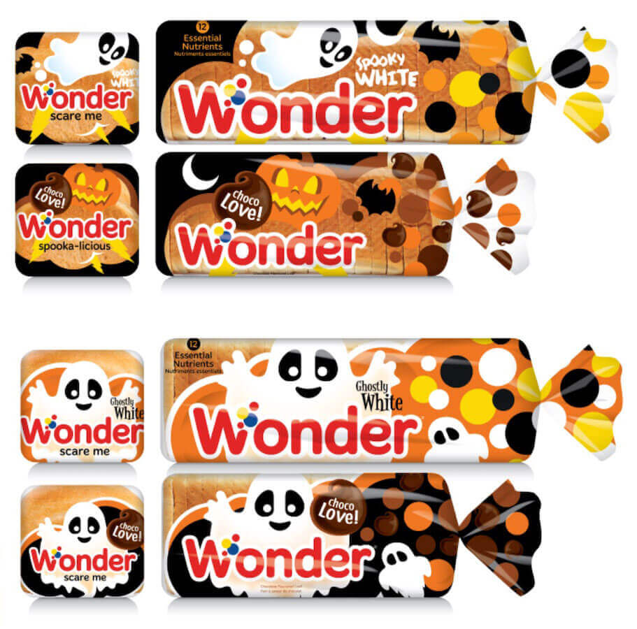
Image Source: SLD
When people think of Halloween, many don’t think of bread, but Wonder Bread was able to find a way to impact sales through clever design. The new designs featured playful Halloween-themed packaging with revised colors, names, and calls to action. Featuring images of traditional Halloween items like ghosts, bats, and pumpkins in playful designs elevates the brand while maintaining the quality and softness that Wonder Bread is known for.
Yoplait: Halloween Tubes
Another brand that does themed Halloween products well is Yoplait Tubes, a drinkable yogurt marketed towards kids. The external packaging features fun designs like spooky black cats, pumpkins, and more with cartoonish drawings. In addition to the external packaging, the internal packaging makes for a scary twist with glow-in-the-dark tubes. Not only does the packaging align with the theme of Halloween but it’s perfect for their target market of children, who will most likely receive the yogurt as a snack for school.
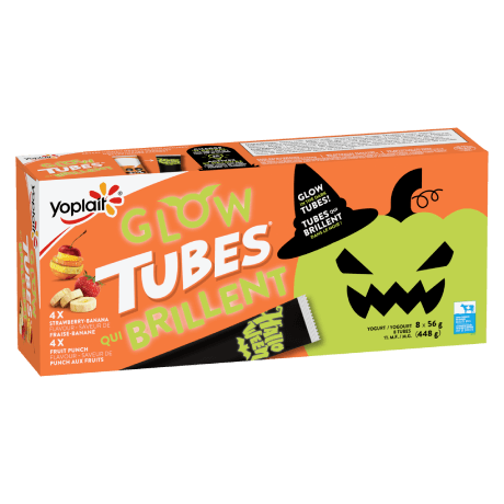
Image Source: Yoplait
Jillian Harris x CANVAS: Holiday
The Christmas season is arguably one of the most important holidays of the year for marketers and brands, as they try to attract heightened consumer spending toward their brands and products. One such way this occurs is through the creation of Christmas or holiday-themed packaging. In the case of CANVAS, the brand equity was tied together with Canadian designer Jillian Harris for an exciting, holiday-themed decor set.
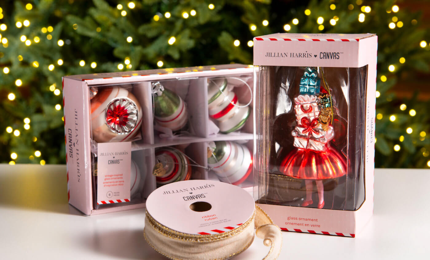
Image Source: SLD
The new holiday collaboration had many priorities, but the main objective was to tie together the existing CANVAS brand equity with the prominence of Jillian Harris to form the new holiday set, which formed over 20 different SKUs. Subtle holiday elements like a striped candy cane and utilizing holiday colors like red and white visually indicated that the product was different from the normal CANVAS brand while retaining the quality it’s known for. The packaging project successfully created a buzz around the brand for the holidays and was a successful collaboration.
Final Thoughts
As the holidays quickly approach, there’s no doubt that CPG brands will have holiday-themed packaging on their minds. From cases of beer that showcase the great Canadian outdoors to spooky loaves of bread, we’ve introduced a few projects that did holiday-themed packaging right. It’s important to remember that with any packaging, creating an instantaneous, emotional connection with your customer through design should be the priority as you look to make your packaging stand out from the shelf. Sometimes, minimalist design or bright colors might not be enough, and it’s critical to leverage strategy when creating your designs for maximum effect on the shelf.