If you are in the food service industry and rely on your locations to drive your business, curb appeal and visibility are key. Operators such as Dairy Queen, Boston Pizza, Second Cup and Tim Hortons all understand that exterior signing is their most effective marketing vehicle, working 24/7 to grab the attention of customers and remind them about their favorite place to grab a coffee or eat. However, all you need to do is drive down a major city road to realize that not everyone is making use of this opportunity. This was made more painfully apparent when I was recently invited by Signs Canada to judge their annual signing competition. I was amazed that in spite of the wealth of great signing companies and the importance of exterior signing, many competition entries still did not leverage these signs effectively.
With more than 30 years of helping food service brands compete for preference and market share, I have come to realize that there are three pivotal rules to ensuring your brand is making the right first impression as well as driving curb side visibility. Following these simple rules will ensure your brand gets noticed and is not lost in the blur of roadside signs.
Rule 1: Own a color and shape
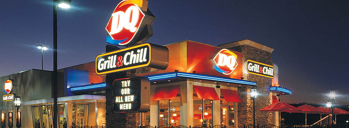
We coined and trademarked the term Blink Factor more than 30 years ago, and when working on the Pizza Hut Cafe program, this idea helped us learn an important lesson that has served our clients and firm well over the years. As you look on how we absorb information, more than 40 percent of what we process is through visual stimulation, and a startling 80 percent of that is through color and shape. When we worked on the DQ Grill & Chill program, we developed an identity that had strong stopping power and communicated this was not an ice cream-only food service offering. When customers are driving down the highway or trying to make a selection in a shopping mall’s food court, they are not looking for food service names, but for a dominant color and shape. DQ’s new icon with the swirls and sense of direction of the Grill & Chill ribbon sign clearly communicated, even at a great distance, the location was offering not only Blizzards but also hot food. The first two questions you need to ask yourself when evaluating the effectiveness of your signing program are does your identity work hard as part of exterior signs and does it have the Blink Factor? The Blink Factor is the emotional moment a customer connects with a product and decides to make a purchase, in the blink of an eye. If not, I would recommend rethinking your identity to ensure you own a dominant color and shape, providing your brand with greater differentiation and visibility from competitors.

Rule 2: Consider the building a sign
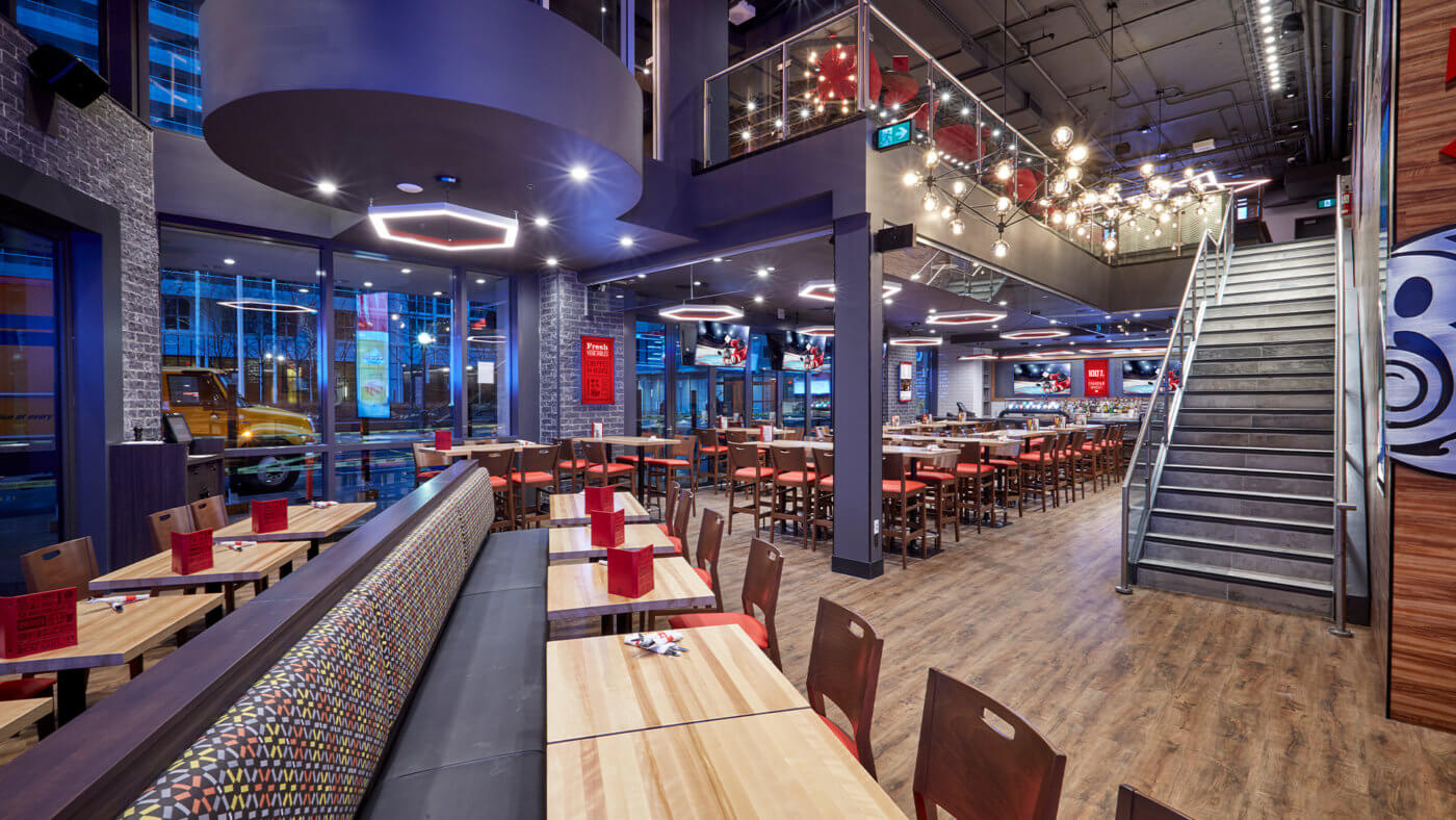
With the increased legislation of exterior signing and the variety of limitations landlords exert over such a program, being able to execute the ideal solution becomes a challenge in many markets. Operators need to reframe their approach to consider the entire building as the most effective sign to draw visibility and preference. In the case of Boston Pizza, Canada’s leading casual dining restaurant chain, it was important to define the building through not only strong brand identity signing but also to convert the entire building into an architectural identity allowing for greater visibility of the brand. Other chains such as Second Cup International and Tim Hortons also leveraged this same approach to great success. In exploring how your building can become an effective branding and communication vehicle, it’s important to determine how the shape and materials used can provide signature elements that stand out amongst the competition. Owning a building color and the use of large windows to allow visibility from the street into the restaurant are all effective tools in ensuring the brand is noticed. In the case of Boston Pizza, we also ensured the outside seasonal patio became a signature architectural element that could easily be seen from a great distance. You may want to consider ensuring your windows provide access to interior digital signs to circumvent challenges with landlords and legislation, since motion is an effective tool in grabbing attention.

Rule 3: Don’t forget geographical context
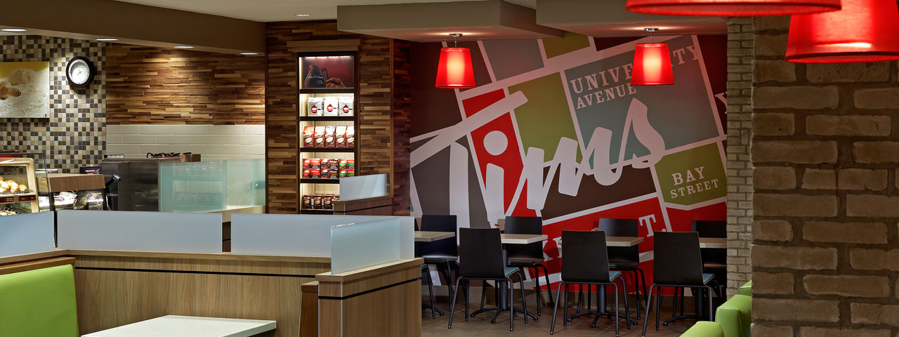
When exploring signing you also need to take into consideration the speed of traffic, and whether the location is set back from the street or on a sidewalk with many pedestrians. Each of these circumstances will require different solutions to gain visibility and communicate an inviting message. In the case of Second Cup International, where many of their locations are in strip malls or high street urban locations, the use of blade signs that are perpendicular to the sidewalk and unique door handles that effectively act as signs for the brand catch the attention of passersby. Windows in these locations also play a pivotal role in attracting attention. For locations where customers will be driving past in their cars, building signs and marketing posters need to be scaled to the distance to the road. Boston Pizza is a great example of a chain that leverages cling vinyl in the windows to bring attention to new offerings or a major play-off game in their urban locations. These signs act as temporary billboards, providing patrons one more reason to frequent the establishment. Additionally, considering the price of billboard can also help in exploring cost-effective and impactful advertising methods within the surrounding urban or high-traffic areas.

With so much competition in the food service industry and the increased limitations being exerted by municipalities on exterior signing, restaurants need to pay greater attention to how they can leverage their locations and exterior buildings as their most effective marketing vehicle. The old way of finding efficiencies by implementing a consistent format sign needs to be replaced to ensure each location maximizes visibility. Considering how each location can best make use of their exterior signing, and a strong, distinct color and shape will ensure your signs do not get lost in the blur of visual stimulation, and stand out as customers pass by.

