Another year has come and gone, and that means it is time to do some reflecting. 2018 saw a lot of companies (including ours) undergo a rebrand, and as with every year, some turned out better than others. While there are many reasons that a company may opt for a rebrand, one thing is certain: not all are created equal. Below we have decided to focus on the good and compiled our three favorites from the year that was. Let’s see if you agree:
Carlsberg
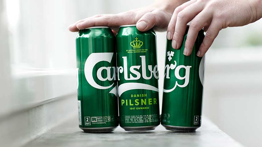
Founded in 1847, Carlsberg has become one of the most recognizable beer companies in the world. Sold in more than 150 countries, it has an established reputation and brand identity that has stayed relatively the same throughout its history. Though there is something to be said for not messing with a good thing, Carlsberg decided that it was time to update its look in the hope of elevating the brand without alienating existing customers.
The new design is a subtle and sophisticated progression from the previous logo, typeface and packaging. The logo has kept the same characteristics, but has been tightened up with stylized letters that are thinner and cleaner, and the introduction of a brighter shade of green is both fresh and eye-catching. Perhaps the most exciting aspect of the rebrand is the new packaging, which includes a “snap pack” that glues cans together instead of the traditional plastic wrapping. Carlsberg claims that this innovation will reduce plastic waste globally by more than 1200 tonnes a year.
Dunkin’
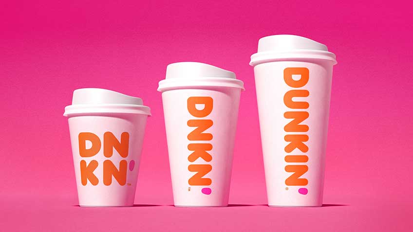
Without a doubt the most contentious rebrand on our list, Dunkin’ Donuts announced in the fall of 2018 that they would be changing their name to Dunkin’. The reaction has been… mixed. While some have argued that changing an iconic company name after 68 years is uncalled for, others have reasoned that donuts are no longer the centerpiece of the Dunkin’ brand. “In recent years as American and indeed the world’s appetite for coffee and coffee-type beverages have grown, we’ve put even more focus on being a beverage-led business,” explained Tony Weisman, the US CMO at Dunkin’.
Rebrands aren’t for the faint of heart, but Dunkin’ did a great job of advertising their name change and humanizing their company at the same time. The fact that they kept the rest of their logo, packaging and graphics relatively similar ensures that their products are still recognizable within such a competitive industry. As the company rolls out the rebrand in the new year, it will be interesting to see how the logo and name are used on exterior signage and within Dunkin’ locations.
Mailchimp
Earlier this year, Fast Company wrote an interesting article that pointed out something you may have already known, even if just subconsciously: a lot of tech and software company logos have evolved to look very similar to one another. Refreshingly, marketing automation company Mailchimp has bucked the trend and instead opted for a quirky rebrand that has some real personality.
The key for Mailchimp’s rebrand was “to retain all the weird, lovable elements” that have defined the company, while also “creating a space for the brand to grow and connect with even more small businesses.” An updated Freddie the chimp continues to serve as the brand’s most recognizable asset, though he now lives next to the company wordmark as part of their full logo. The wordmark itself is fun and ignores convention, and it goes perfectly with the company’s new brand color: Cavendish Yellow.
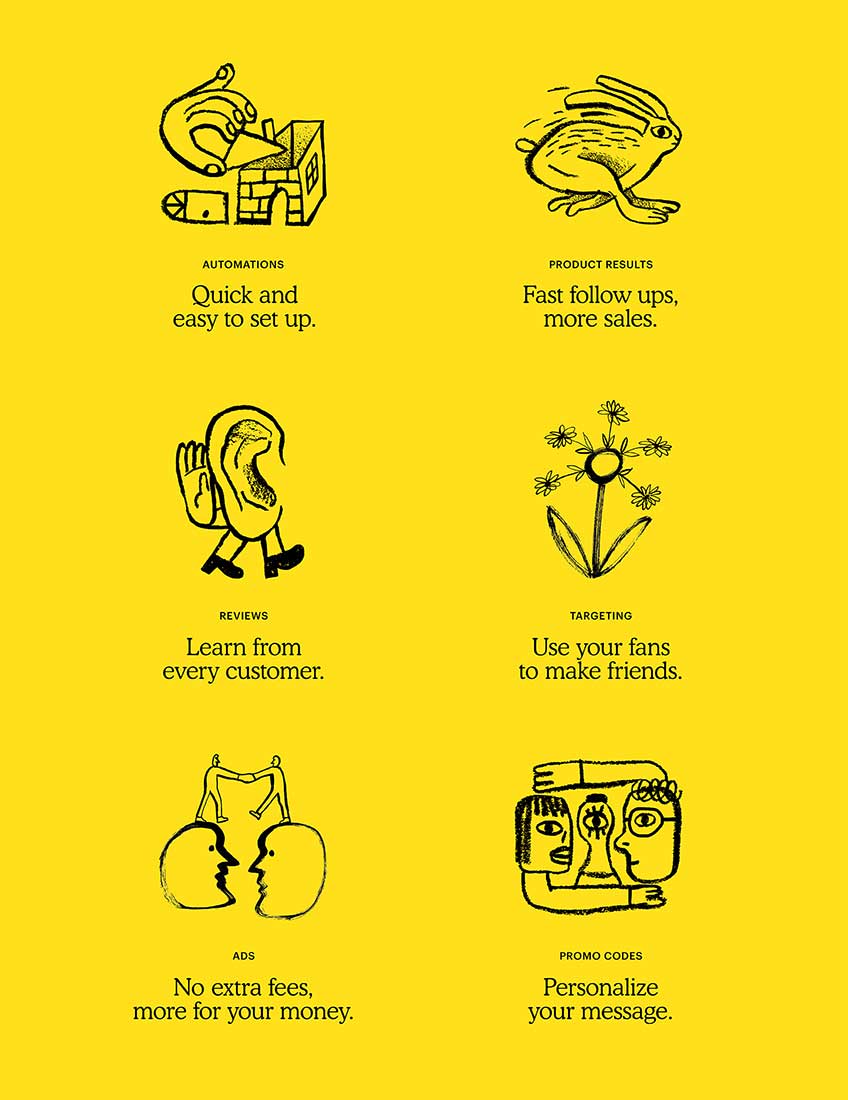
Furthering their new look, Mailchimp has introduced a series of illustrations and animations with the aim of communicating “complex tools and marketing practices in a simpler and more human way.” The drawings are playful and unexpected, and are sure to make the company seem approachable, even as it continues to grow in size.
Do you agree with our picks? Leave a comment below and let us know what your favorite rebrands of 2018 were.