Digital technology has impacted almost every industry in recent years, including the grocery category. You can now use your computer or phone to have someone else pick up your groceries and deliver them to your doorstep. These delivery and shopping services, such as Instacart and AmazonFresh, are meeting a key need for convenience and putting pressure on grocers to compete with them. Loblaws, for instance, offers a “Click & Collect” option, while Longos has a strong Grocery Gateway delivery service. And yet, why does this need to avoid the grocery store exist? Has grocery shopping in a store become so much of a chore that customers would rather interact with the digital channel instead?
This question is important to consider, since physical stores remain the only channel involving all five senses and offering an in-person social atmosphere; both of which are elements that will improve brand connection. If many customers today prefer to skip store visits, there are clearly some pain points in that environment that are not being addressed.
Designing Better In-Store Grocery Shopping Experiences
A main source of negative emotions in grocery stores is navigation. Online grocery shopping allows easy product search options and clickable department categories, but in a store, you have to move through the space physically. This experience can be frustrating and time-consuming, especially when you can’t find the right aisle and feel like you are wandering in circles. Grocery stores are also generally large spaces with many products, which can lead to feeling overwhelmed and confused. These emotions are not ideal customer experiences of course. So, how can stores be designed to make navigation easier?
One way is to create distinct zones through retail design. Changes in textures, fixtures, and styles can break up an environment into different areas so that it is not so overwhelming to process. Another way is to include “landmarks”, where distinctive features help orient customers. Some retail stores, such as Lowe’s, have even developed augmented reality navigation apps to provide customers with a map of the store that is displayed on their phone.
Strategic design and implementation of traditional in-store navigational signs can also play a large role in making a store less confusing to move through. The following elements of navigational signs can help to ensure clear and helpful communication.
Legibility
While interesting fonts can give a store more personality, the most important aspect to consider is its legibility.
“Department signage is often treated as a décor item. It can span the length of an entire wall, and ‘Script’ font can be used quite effectively to help set the tone or personality of the store. However, script font shouldn’t be used for aisle signage.” – Sheryl Keller Ziesmann, Director, Wayfinding.
A font that is clear, and appropriate in size will make communicating with customers easier. Sans serif fonts are often clearer. Customers want to be able to take in information quickly and from various distances, so it is important to consider other variables such as lighting and signage materials.
Color Considerations
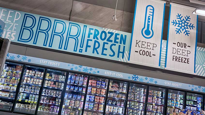
Color is a useful way to provide category distinctions on the background of signs, in words, or in symbols. In Shikatani Lacroix’s recent work with M&M Food Market and Calgary Co-op, we used unique colors for each department to help customers easily find what they are looking for and create distinct color blocks for different areas. We also used color to leverage well-established associations and reinforce communication, such as the use of green for fresh food/vegetable sections or blue for frozen food departments.


Symbolic Communication
Symbols provide another layer of communication. They can help overcome language barriers, communicate with customers that prefer visual cues, or help reinforce category distinctions. For example, Calgary Co-Op uses cow and chicken symbols to help identify the meat department, and the pharmacy department signage includes symbols of band-aids, health, and hearts. In M&M Food Market, the “Frozen Fresh” section is blue with snowflakes and thermometer symbols.
Visual Representations
Imagery, graphics, and food photography also improve communication. These visual aids are often easier to see than words at a distance, and compelling photography will attract customers to explore specific sections. For example, in M&M Food Market, food photography above each section name helps reinforce the message and makes the environment and products more appealing. In Calgary Co-op, large fruit and vegetable graphics catch customers’ eye and direct them to the “Our Harvest” department.
Strategic Placement
Proper location of signage can ensure that customers have the information they need when they are looking for it. Therefore, it is important to consider visibility along key traffic areas and walkways as customers move throughout the store. Developing a wayfinding strategy map can help to plan out directional cues. Signage should also be high enough to not be obstructed at a distance but not too high that it is not noticeable.
Directional signage is important to the experience of a store. Its legibility, color, imagery and graphics, and locations will all make visits less stressful. Considering these elements will improve navigation in your store and make grocery shopping more pleasant, which will enable you to better connect with your customers, build loyalty, and deliver positive brand experiences.

