
From subtle changes like Walmart’s new logo to Cracker Barrel’s brand design crisis, 2025 was a year full of brand and logo design stories. 60% of customers report avoiding a brand if its logo feels unattractive or outdated. With brand logos and branding related to customer trust, these are essential items that every brand needs to make sure are relevant.
Effective logo designs and brand refreshes are critical for brand health and relevancy in the marketplace. We asked our colleagues at SLD about their favorite brand design stories from 2025, ranging from local Toronto seafood establishments to WNBA expansion teams and a treasured legacy frozen waffles brand.
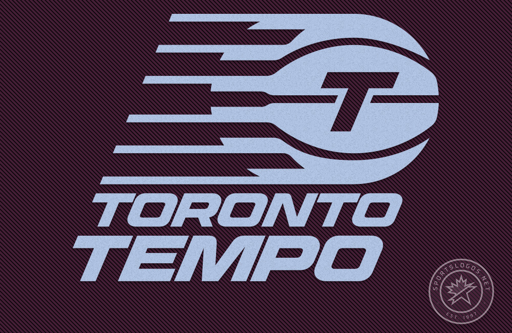
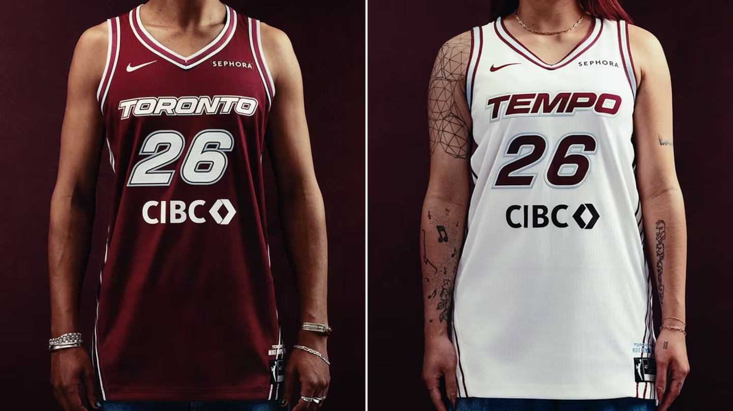
Melinda Deines: Toronto Tempo
The WNBA has experienced a surge in popularity over recent years, with double-digit increases in attendance, sellouts, and average viewership. With this explosion has come expansion, and Toronto is set to get its first WNBA team by the name of the Toronto Tempo. The team released their branding for 2025, featuring a brand-new logo and team colors.
“The logo does a great job playing on the idea of speed,” says Melinda Deines, Director of Strategy at SLD. “The ball in motion, the angled font – it feels like it’s sweeping by, capturing the feeling of the game. It’s fast-paced, the ball is whipping around, the players are moving around fast, the logo just fits perfectly.”
Image Source: TSN Official Website
“It’s hard to create a logo that is both feminine and tough, and they did a great job of creating that. It has a nostalgic feel to it, the color choices work perfectly together, and the naming is clever with the idea of speed.”
Jim Chiang: The Chopped Leaf
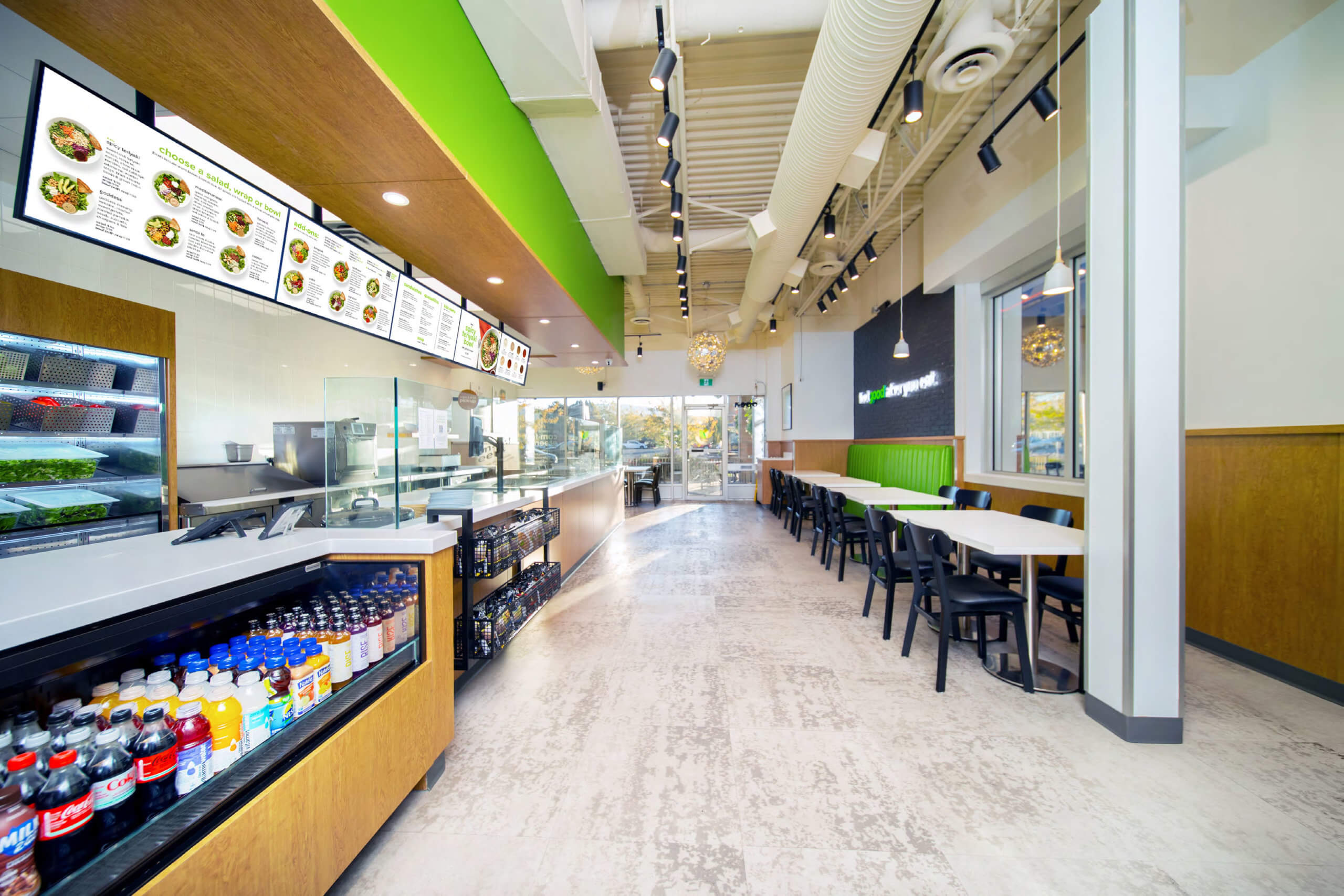
A staple in Western Canada’s QSR sector, The Chopped Leaf thrives on big flavor in a category that doesn’t always put taste first. There is a consumer perception that healthy is boring, that salads can’t be exciting, and that traditional “comfort” foods aren’t healthy. The Chopped Leaf revamped its brand position, branding, and store design to reflect a change in attitude that aligned with its slogan of “feel good after you eat”.
“This rebrand really shows that meaningful change doesn’t require dramatic moves,” says Jim Chiang, New Business Coordinator. “It preserved the brand’s core assets, updates what no longer serves the business, and supports the company as it moves into its next stage of growth”.
Image Source: SLD
“Consumer context is critical,” Jim says, “and this brand really understood the emotional and practical needs of the customers. Even the height of the prep area was adjusted, along with materials and color palette, because the brand successfully understood its consumer. By balancing this with the needs of the operator’s business priorities, especially within a franchise model of QSR, The Chopped Leaf minimized risk and captured the value of the rebranding process – plus it’s delicious!”
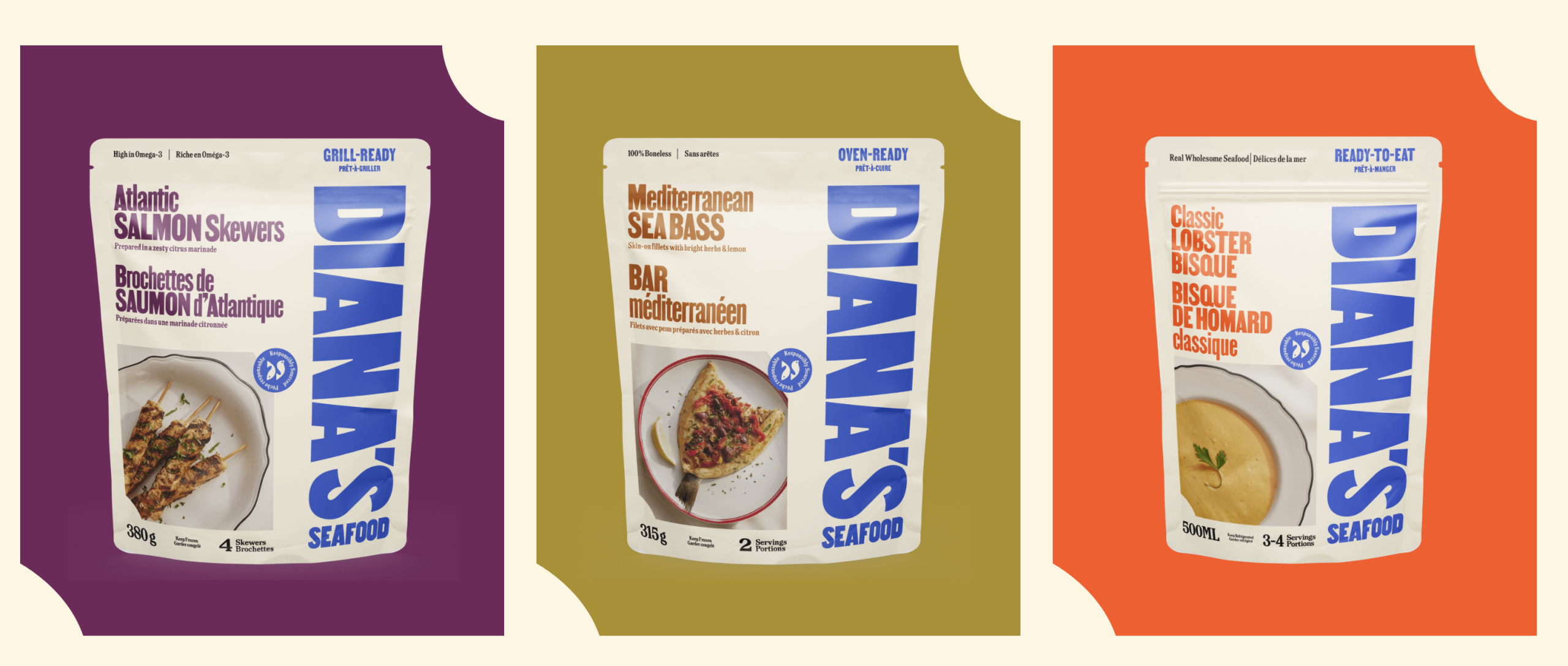
Ellen Evered: Diana’s Seafood
Seafood has been a staple food for thousands of years. Seafood products, especially the frozen ones, haven’t usually been known for their exciting designs. Diana’s Seafood took that idea and used it to create a strong brand identity that flows like the ocean: instant recognition with strong yet simple design choices
“I think what they do best is the bold use of typography, color, and illustration that follows a cohesive system across all their touchpoints,” says Ellen Evered, Senior Graphic Designer. “Aside from being a local staple and a Scarborough-based business, their strategy is grounded in a strong representation of their 40-year history and a unique embrace of feminine branding in a sea (pun intended) of founding fathers, with a focus on being the “Mother of Seafood.”
Image Source: Diana’s Seafood Official Website
“The branding is strong and owns a color, it has character that creates an emotional connection across all their branded touchpoints, their packaging is simple and follows a grid. This brand has the blink factor and stands out on the shelf.”
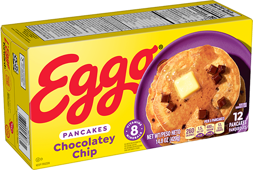
Lori Smale: Eggo Waffles
As Stranger Things fans know, Eggo waffles are one of the most recognizable frozen breakfast foods in North America. The iconic brand has been around since the 1950s, making breakfast delicious in a pinch. With such an important legacy and recognizable brand assets, rebranding can be a challenging task. However, the latest Eggo rebrand in the USA perfectly blends a legacy brand with new, updated elements for a package that captures the Blink Factor.
“This is a classic brand that needed to reinvent itself to stay relevant in a changing market,” says Lori Smale, Account Director. “This was a hard one to pull off, especially since the frozen aisle has the extra barrier of the freezer door. The designs really have to be bold to capture shoppers’ attention.”
Image Source: Ego Official Website
“This redesign perfectly marries modern with vintage, striking a balance that feels very relevant in today’s market. It’s incredibly simple and can be rolled out across a large portfolio of SKUs and flavors. The simplicity of it speaks loudly and really emphasizes that less can be more. The bullseye product hero shot really delivers on the Blink Factor, and is sure to stand out in the frozen section to hungry customers.”
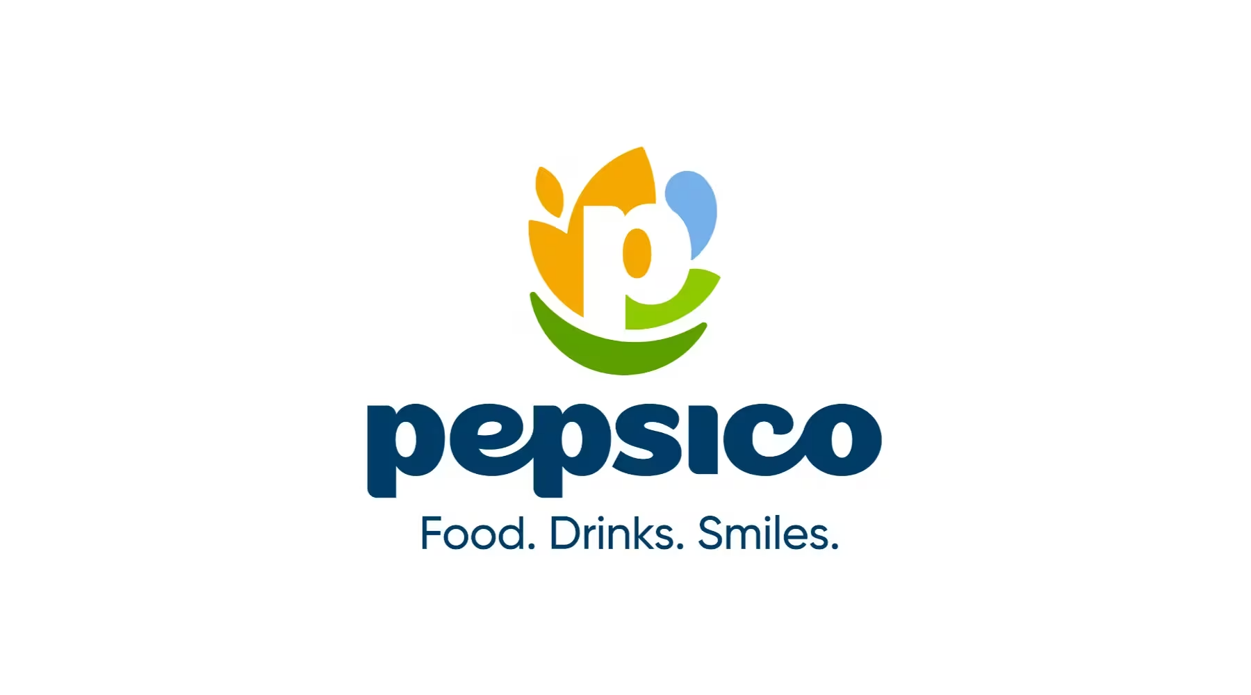
Christopher Woo: PepsiCo
Even some of the largest companies in the world need brand refreshes sometimes. PepsiCo decided its corporate branding needed an update to truly encompass the breadth and variety of its offerings.
“I really love how PepsiCo’s different offerings have been integrated into the new logo, along with that friendly smile,” says Christopher Woo, Design Director. “I chose this rebrand as my favorite because it’s more approachable and friendly, it feels more human than the global, corporate look it had previously.
Image Source: PepsiCo Official Website
“For me, this is a winner because it really connects with the Blink Factor, especially the first tenet: ‘The heart wins every time’. Adopting a more customer-centric approach to brand representation changes the perception from that of a big corporation to something that connects with people in a more approachable and friendly way.”
Conclusion
Designing a brand and packaging can be challenging. When executed correctly, however, they can attract customers, boost sales and create brand loyalty. Inconsistent branding that doesn’t reflect your company’s essence, however, can have the opposite effect. Our team bring up many key ideas in what makes the brands they chose so effective. Color is essential for standing out on the shelf, and creating a cohesive system that incorporates this and other brand elements can help customers identify your brand instantly. Simplicity is an underappreciated aspect of branding, even though it is often more effective. Most importantly, brands that create emotional connections with their customers always win, and that’s the true power of The Blink Factor.
