Tropics Turned Up!

After almost 20 years, Tropicana gets a sunny new identity designed to shine even behind cooler doors.
CLIENT
PepsiCo Canada
PROJECT

Package Redesign

RELATED SERVICE

Package Design

THINK

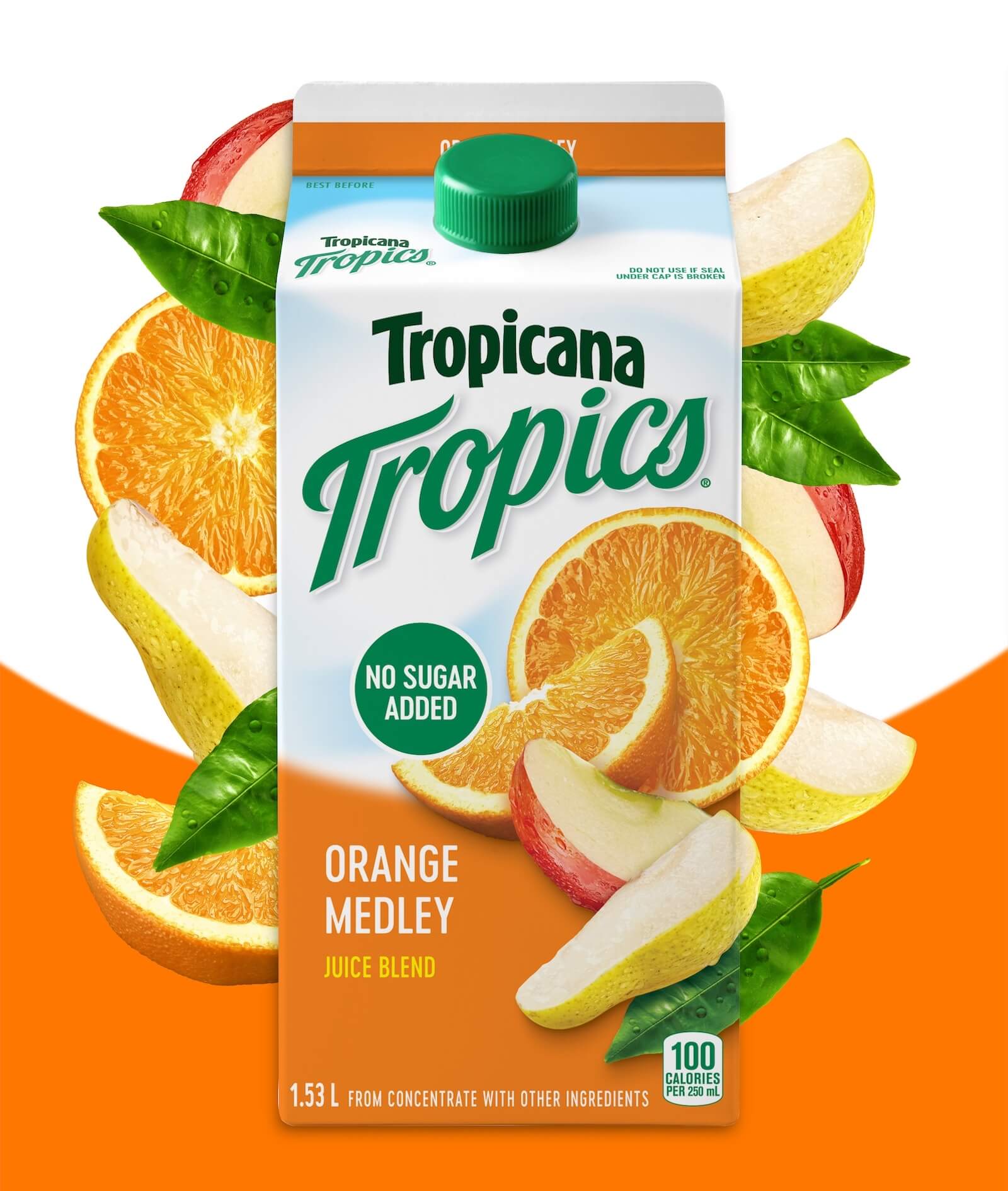
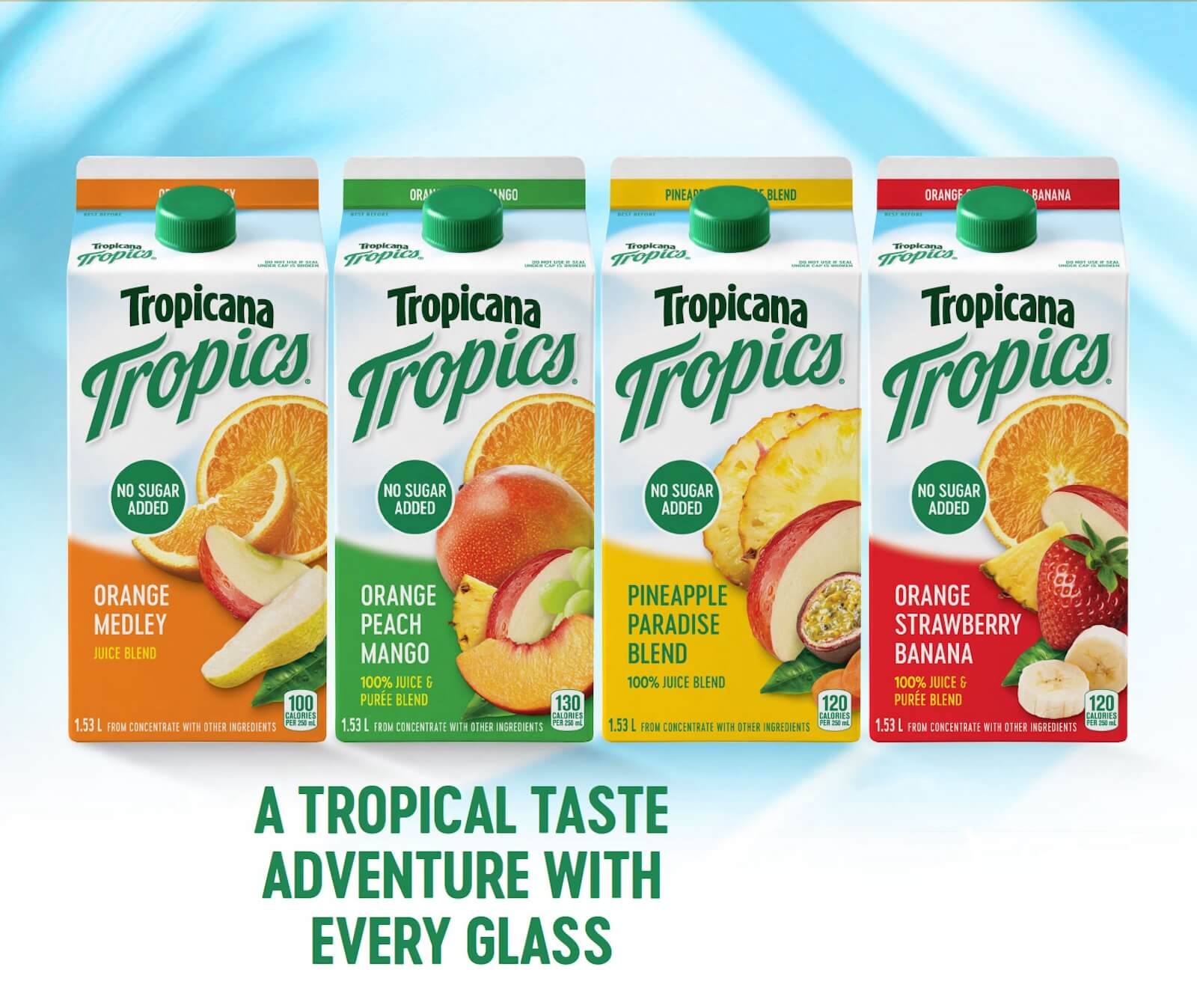
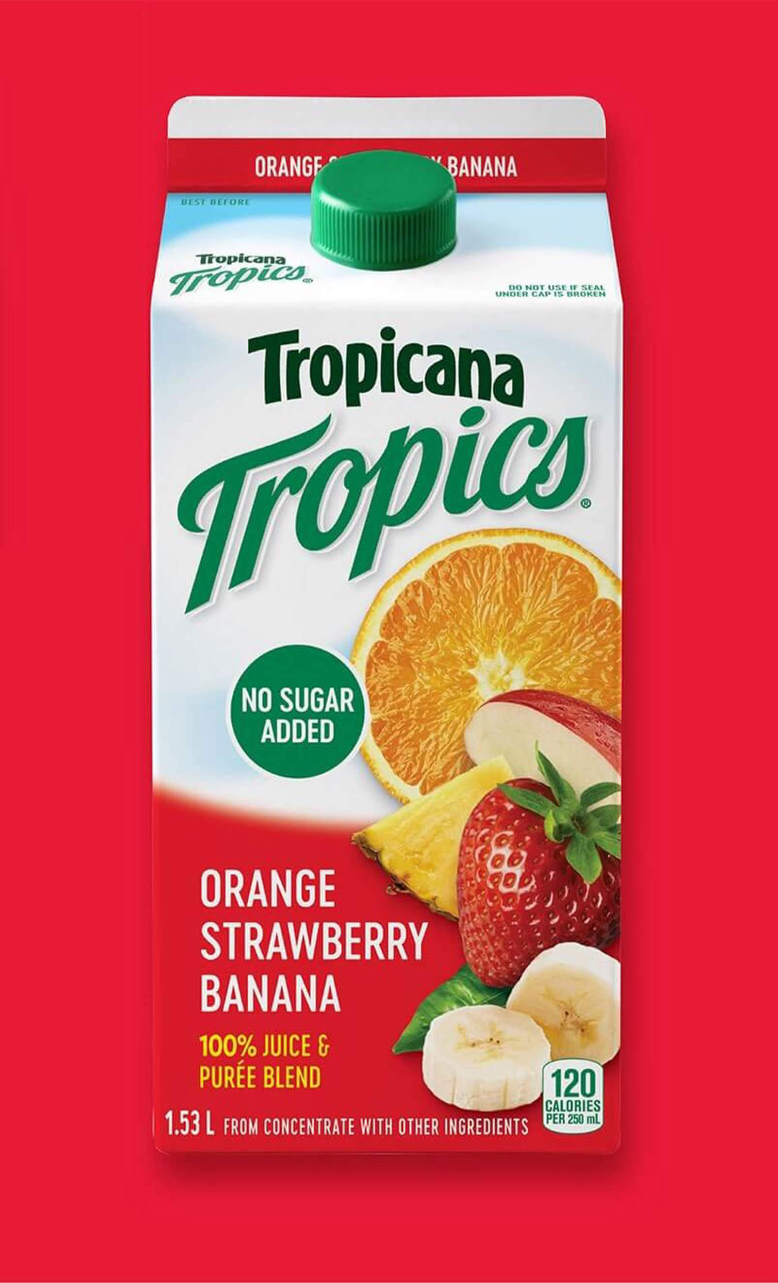
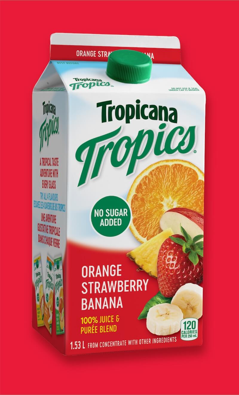
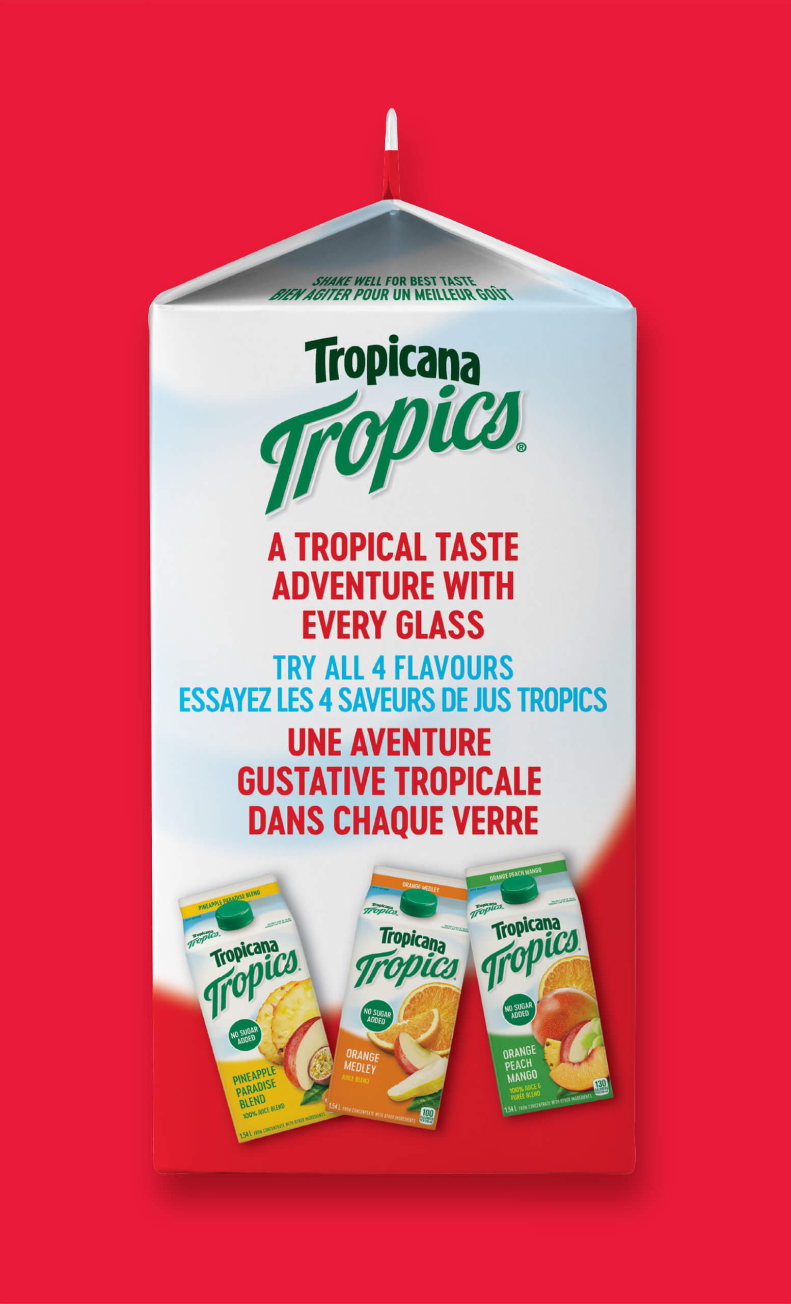
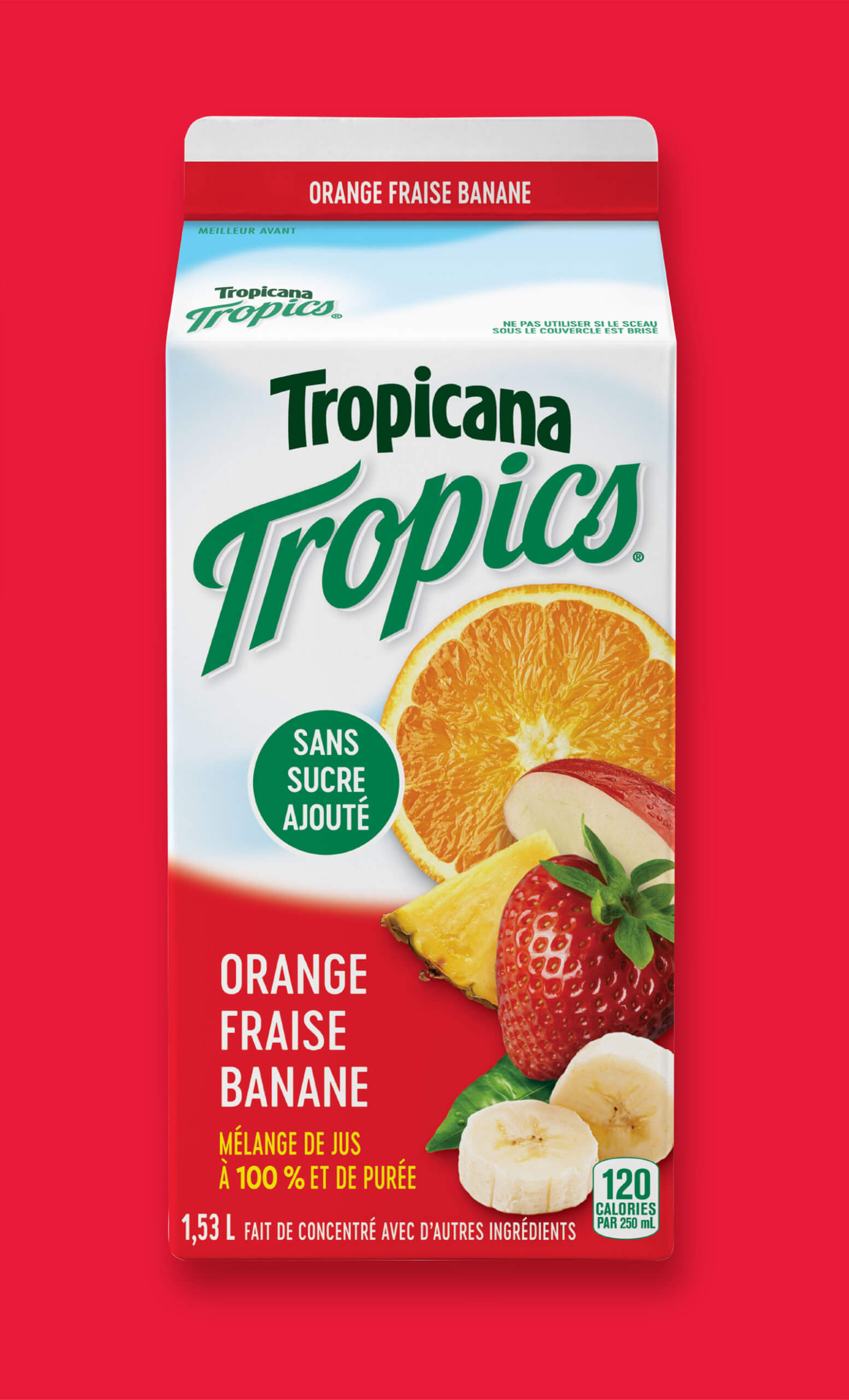
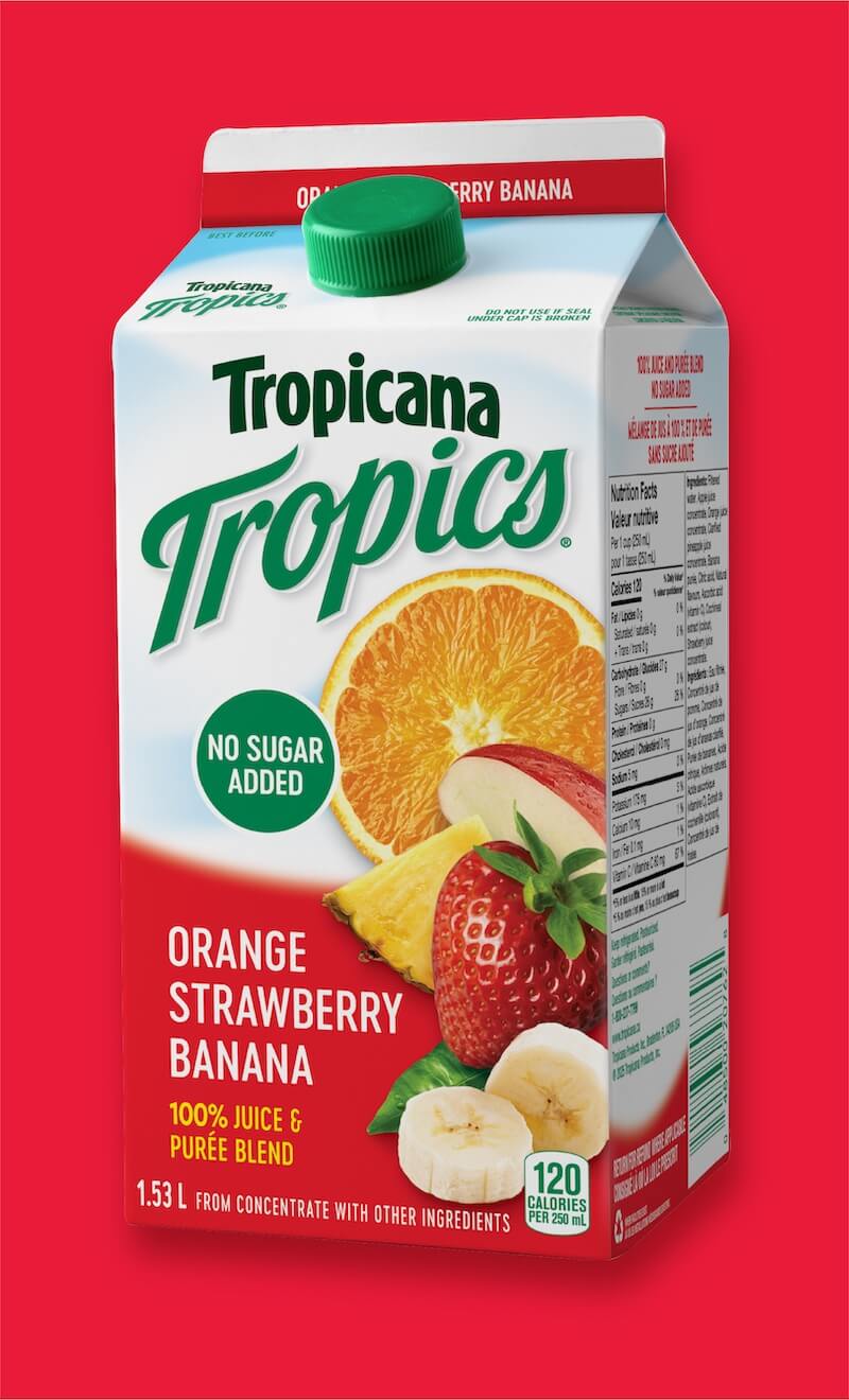
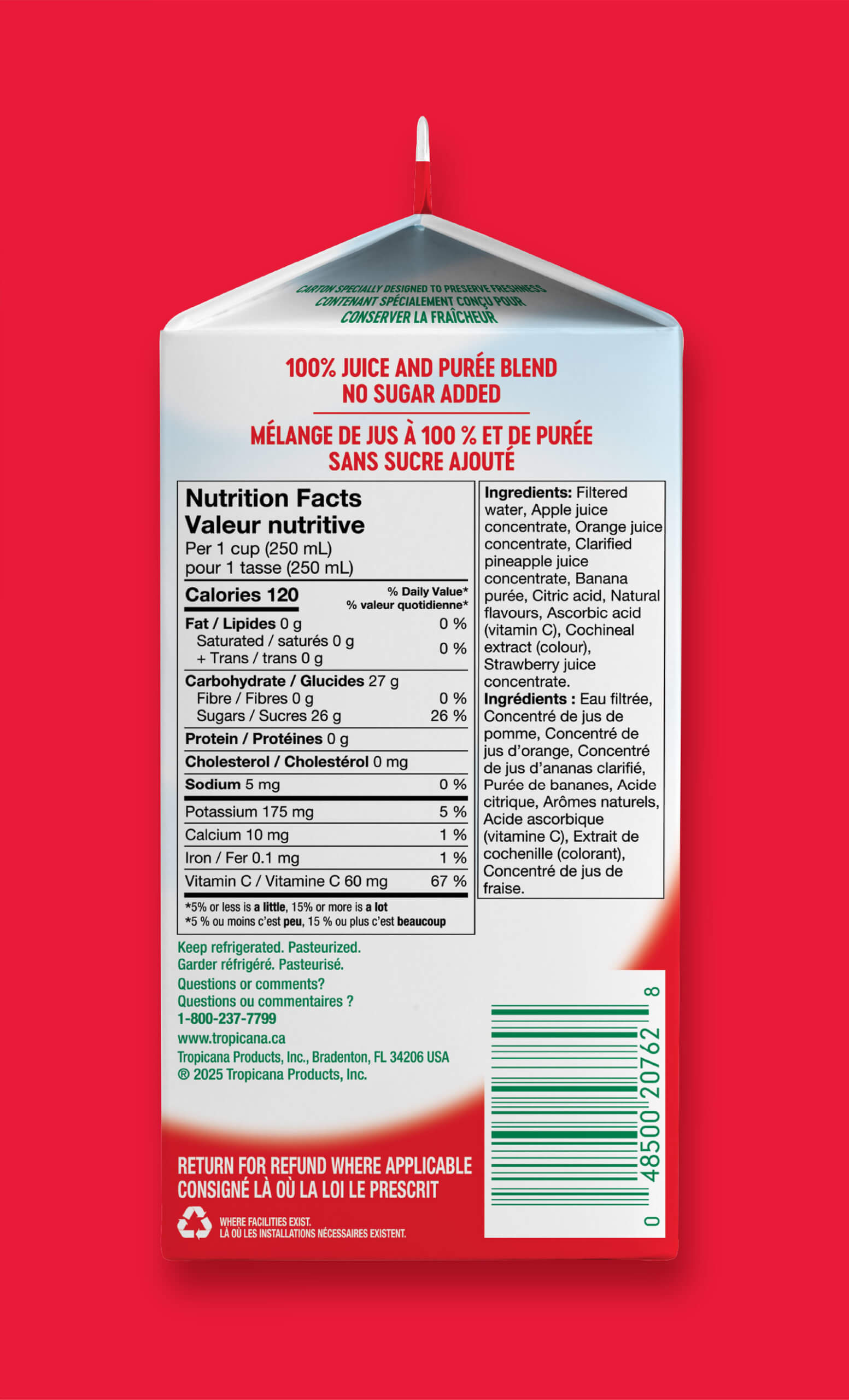
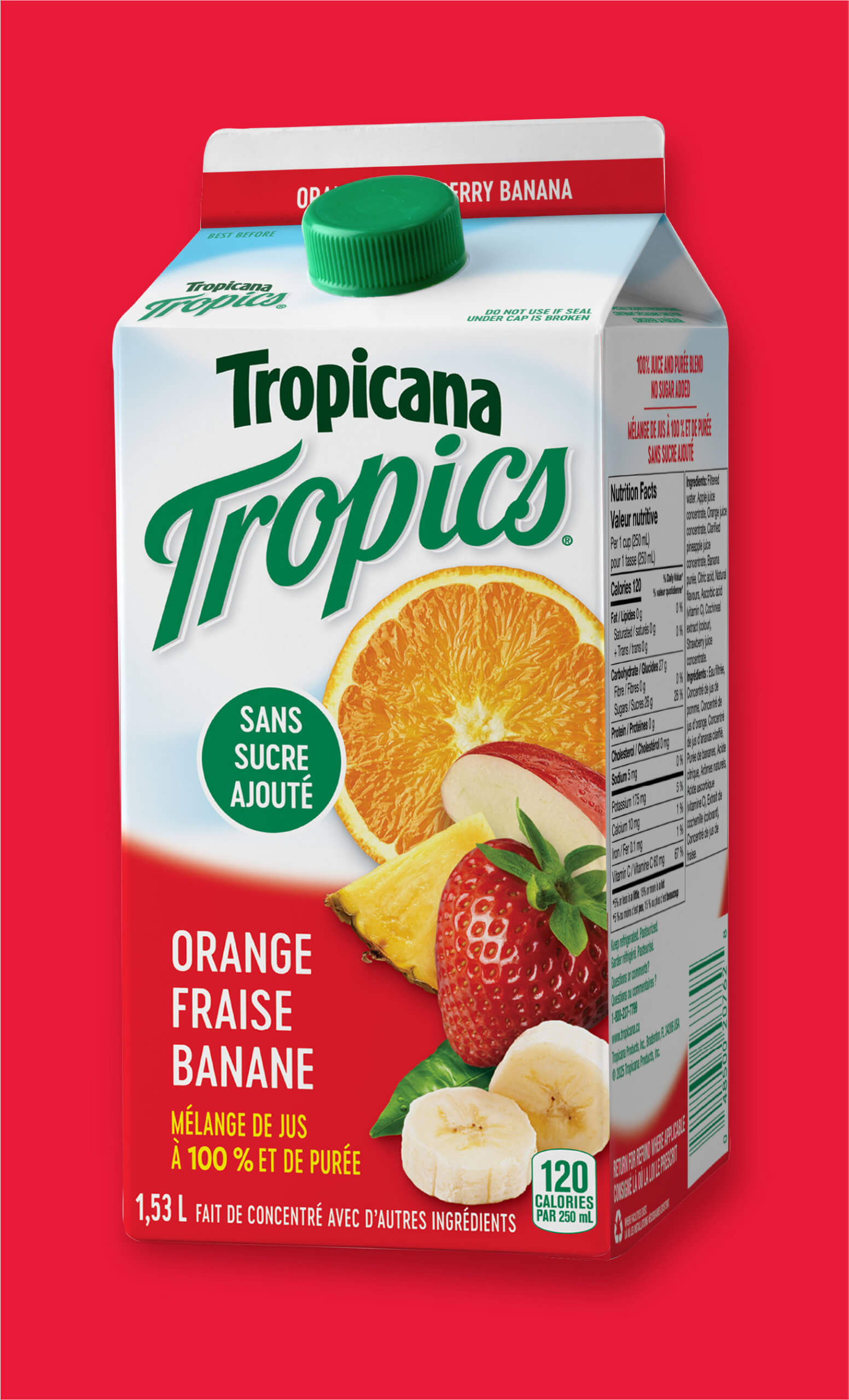
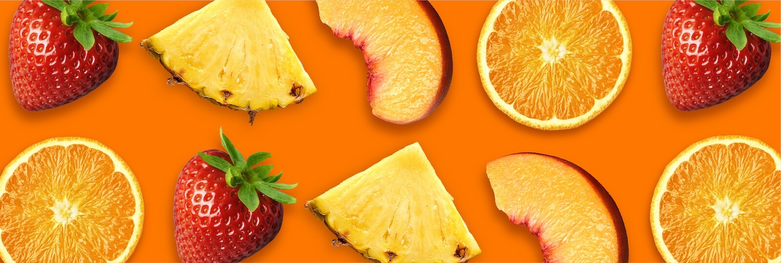
Tropicana Tropics has remained a familiar favorite in the juice aisle, but after almost two decades without a redesign, it was time to turn up the vibrancy and rethink how the brand showed up on the shelf. The packaging design needed to clarify flavor and reinforce Tropicana’s brand presence across the lineup, but without losing what longtime consumers love the most: bold fruit flavor, natural goodness, and the essence of a tropical escape.

BLINK

The new design was created with cooler doors and rapid in-aisle decision-making in mind. Key claims like “No Sugar Added” and “100% Juice” are prioritized through typography hierarchy and repositioned for improved legibility, even at lower shelf placements. The Tropicana name gets the spotlight it deserves with an enlarged and modernized word mark. The new pack also introduces a layered backdrop featuring horizon-inspired blues and sun-washed gradients that create a vacation feeling without compromising flavor focus. The fruit imagery is vivid and natural, signalling both taste and quality. Strategic color blocking enhances shop-ability across the lineup, a standout element for juice shoppers who buy by color and scan fast. From the newest addition “Orange Medley” to “Pineapple Mango Passionfruit” and “Orange Peach, Mango”, the packaging delivers unmistakable flavor cues and the sunny shelf presence that lives up to the Tropicana name.